
ShopeePay Transfer Design Revamp
Overview
ShopeePay is one of the most important products of Shopee, it is widely used by millions of users especially in Indonesia, Philippines, Vietnam and Thailand. I was fortunate to be the lead designer for the revamp of ShopeePay Transfer, the payment feature which allows users to transfer money to their friends and family. There are altogether 2 revamps with significant results and improvement.
Project
ShopeePay Transfer Design Revamp
My Role
Lead Product Designer
Scope
Competitor Research, UI UX Audit, Guerrilla Usability Testing, Lightning Decision Jam, UX UI Design, Prototyping
Year
2020 - 2021
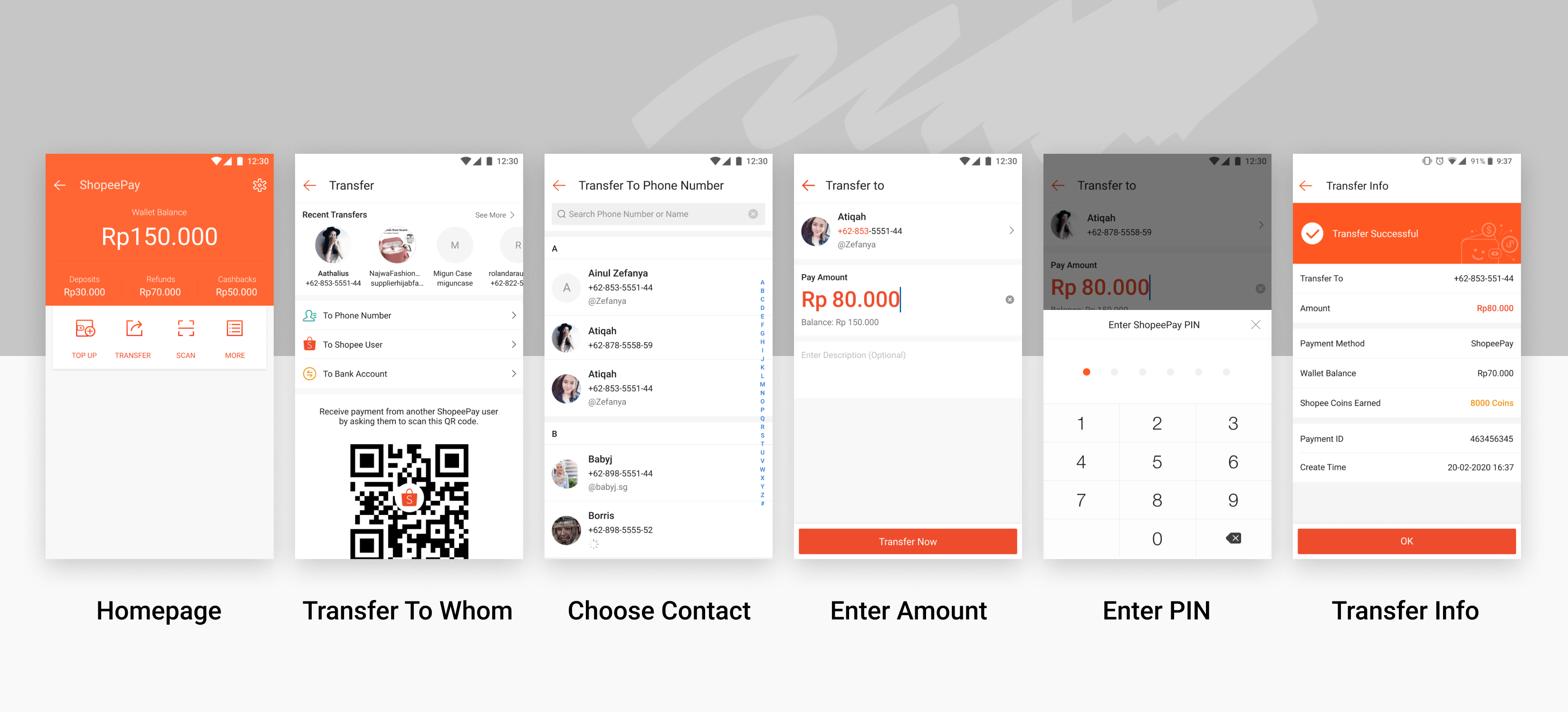
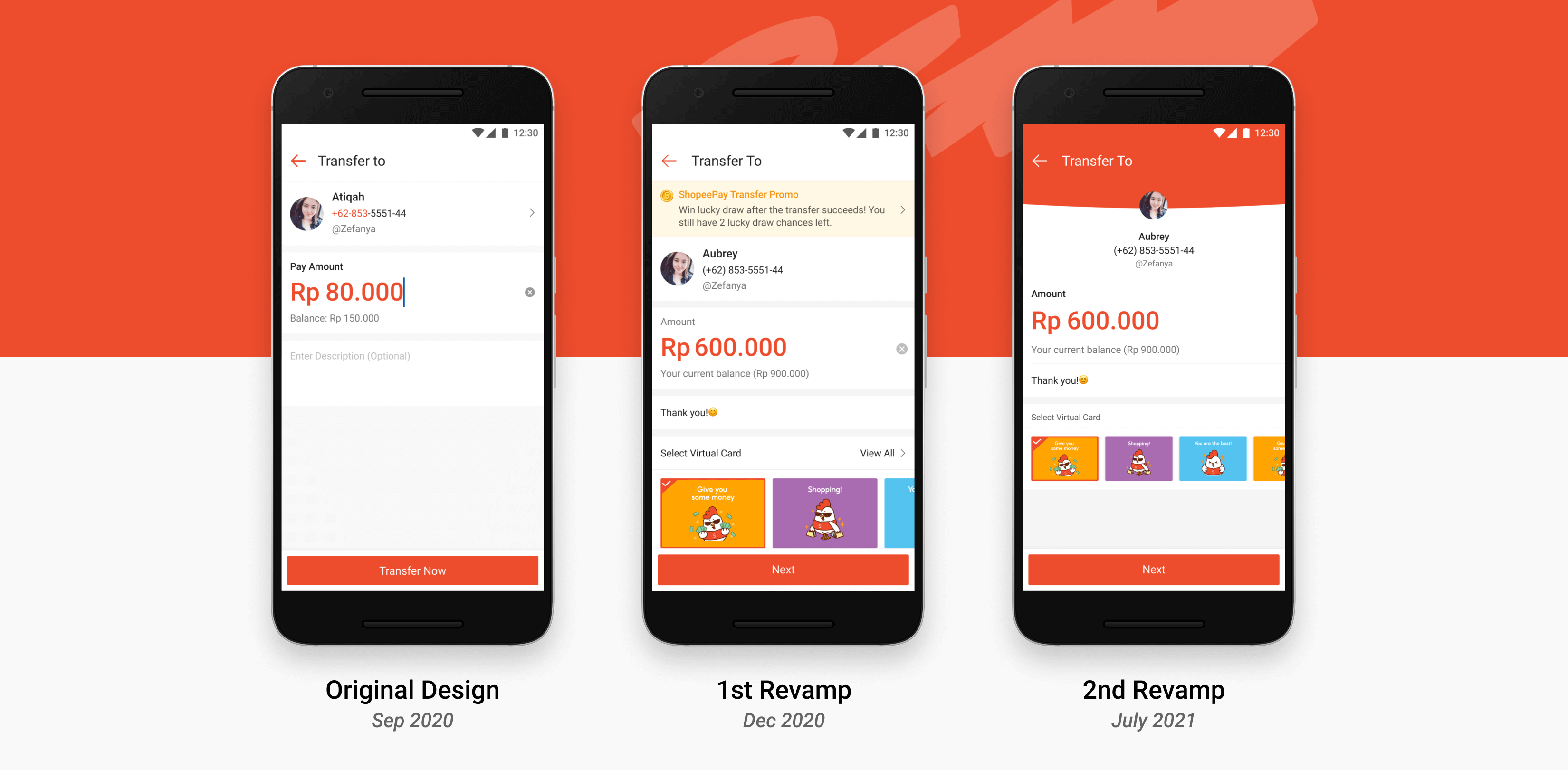
Original Design
This is the original design of ShopeePay Transfer in September 2020, it looked very standard, dull and only had the basic functions.
Objectives
After several meetings with the product manager(PM), we agreed that the main objectives of the revamp are:
· Motivate more users in using ShopeePay Transfer by enhancing the user experience of it
· Make the flow visually appealing and interesting
· Launch new design in our biggest market Indonesia
Competitor Research
This competitor research showed:
1. ShopeePay’s main competitors (GoPay, Ovo and Dana) in our biggest market Indonesia only got the basic functions in their payment apps.
2. Some of the most popular payment apps in the world (Alipay, Wechat and Venmo), they have red packet, gift cards and share transfer activity functions.
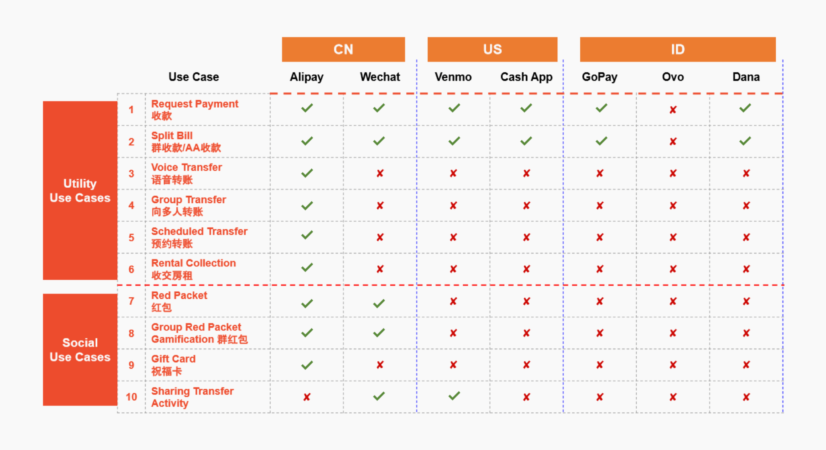
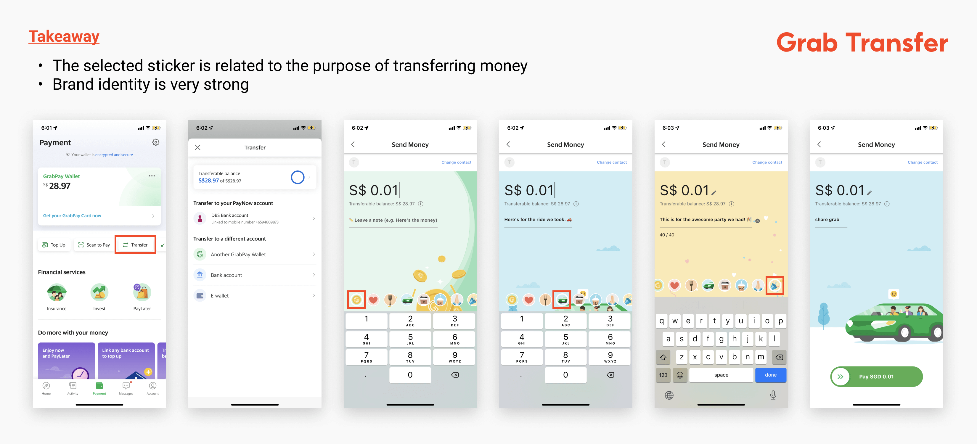
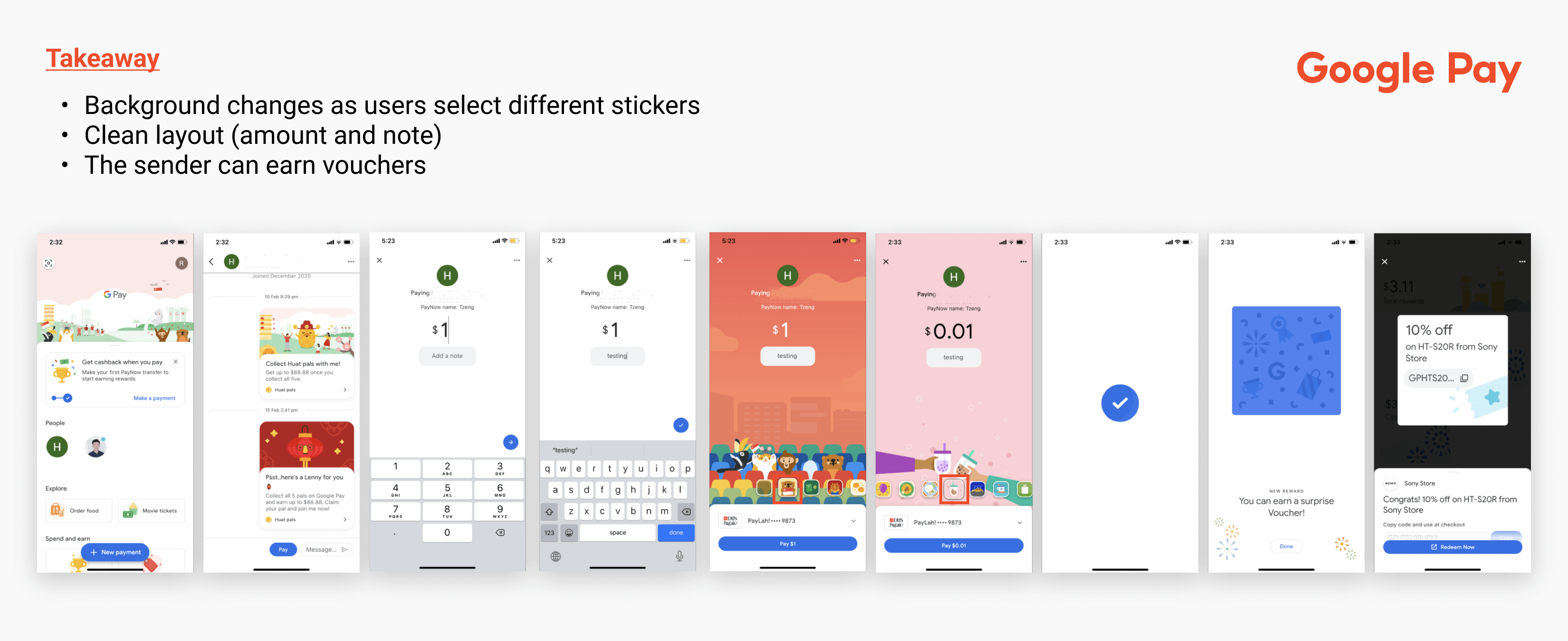
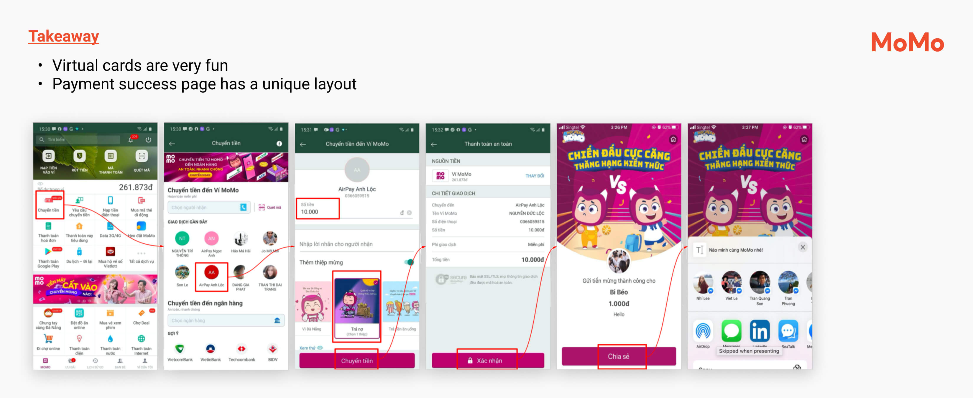
I also looked at Grab Transfer, Google Pay and MoMo E-Wallet, I learned that all these successful payment apps have some interactive elements.
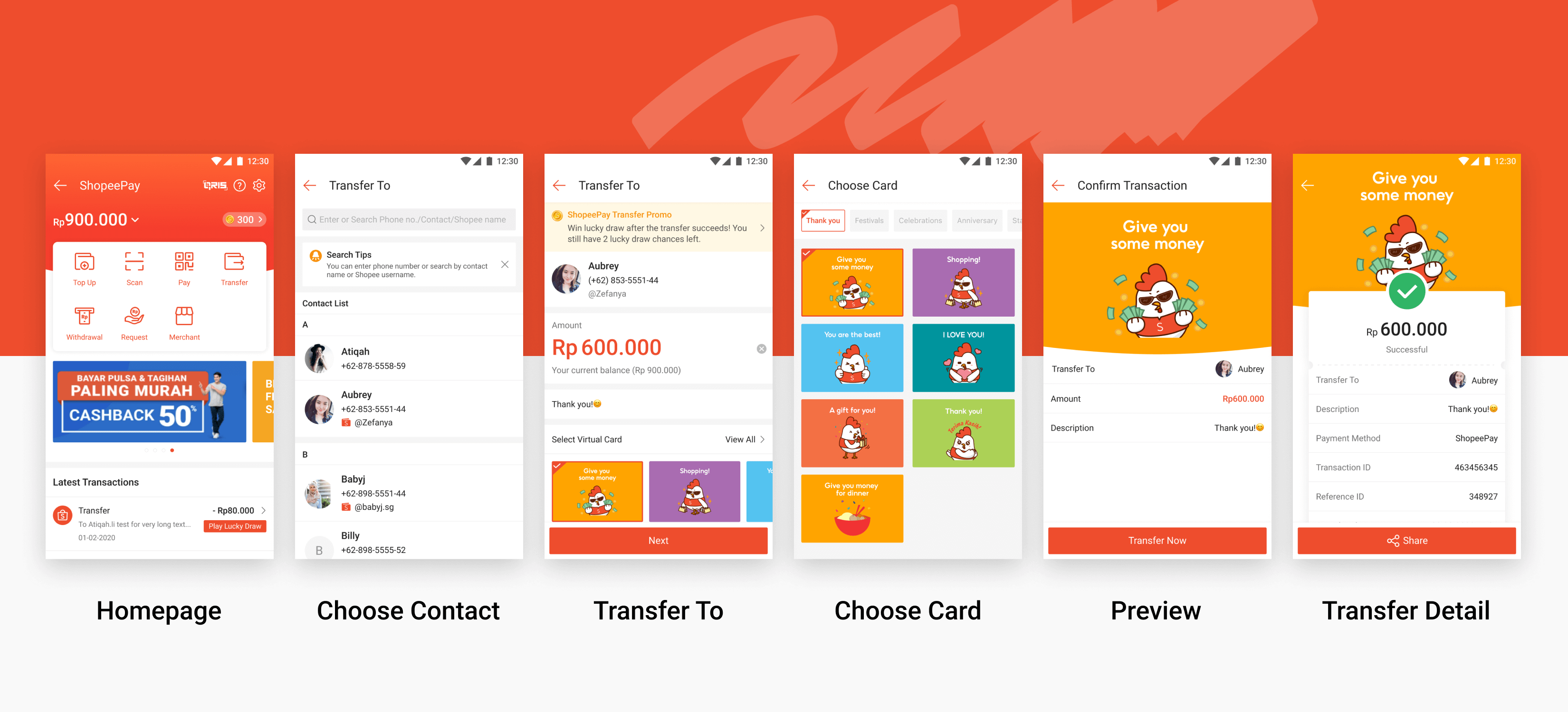
First Revamp
On the first design revamp in Dec 2020, based on the insights we got from the competitor research, we added:
· The virtual card selection to make the flow more interactive
· A preview page before transaction
· Lucky draw to earn money after the transfer completes
· The function to share transfer detail
Second Revamp
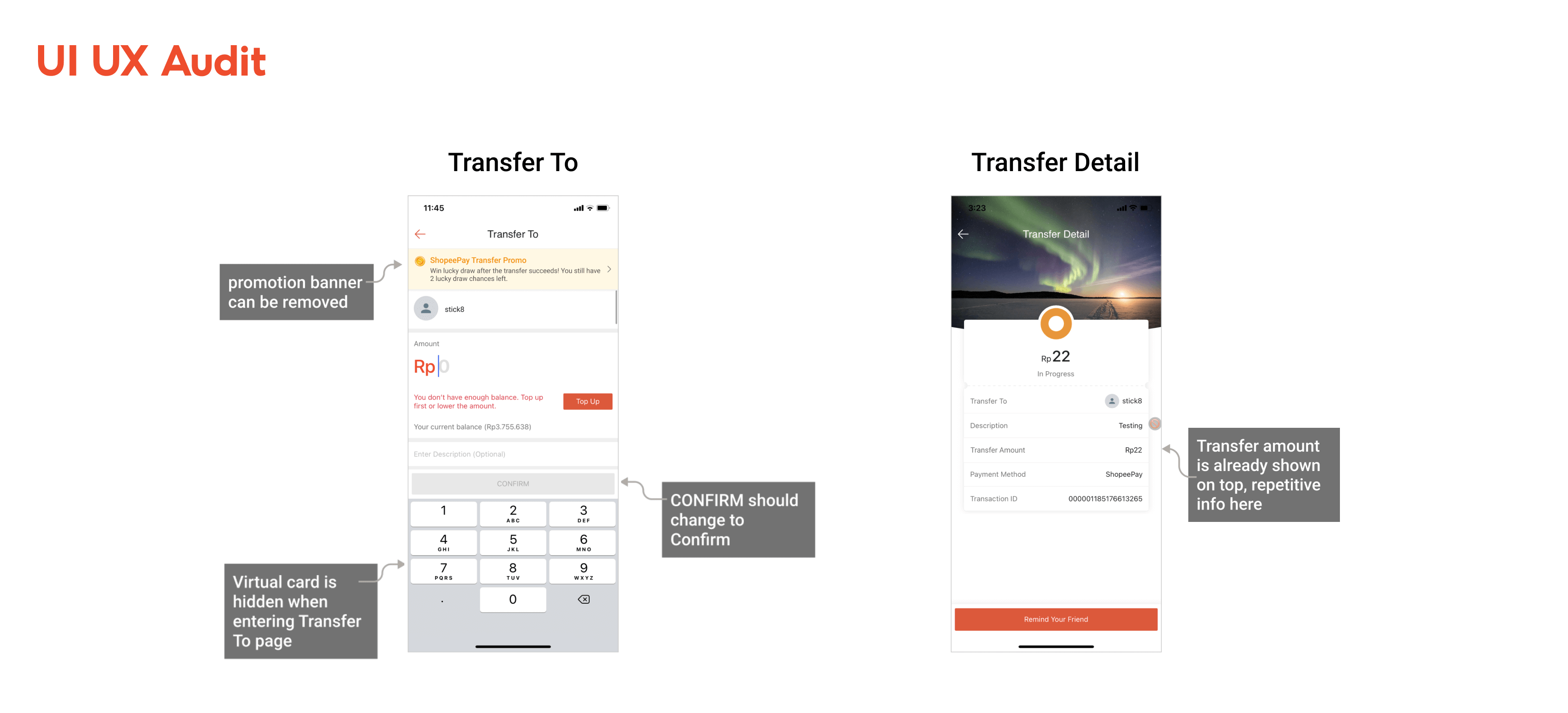
After the first revamp, I decided to take initiative in conducting a UI UX audit in May 2021 on the launched design. The audit allowed me to review the functions and evaluate them from a user experience perspective, I discovered issues like repetitive and unnecessary information, virtual cards being blocked by the keyboard.
Guerrilla Usability Testing
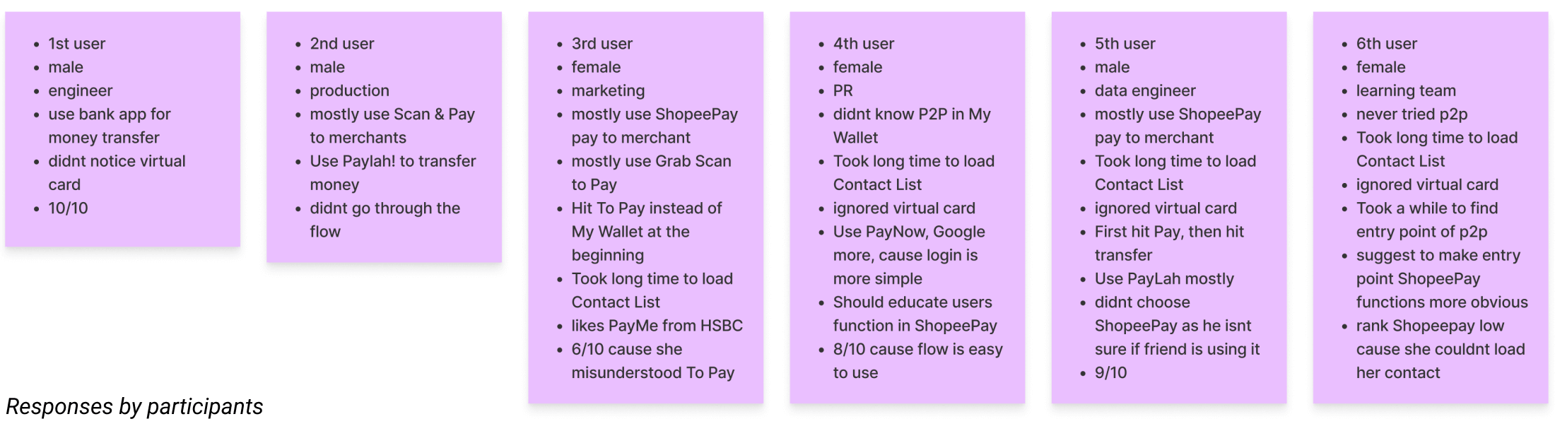
After identifying the pain points of the launched design, I invited my PM to do a guerrilla usability testing together. It is a fast but effective way to uncover UX problems and get high-level feedback to improve a design. This is the outline of the test:
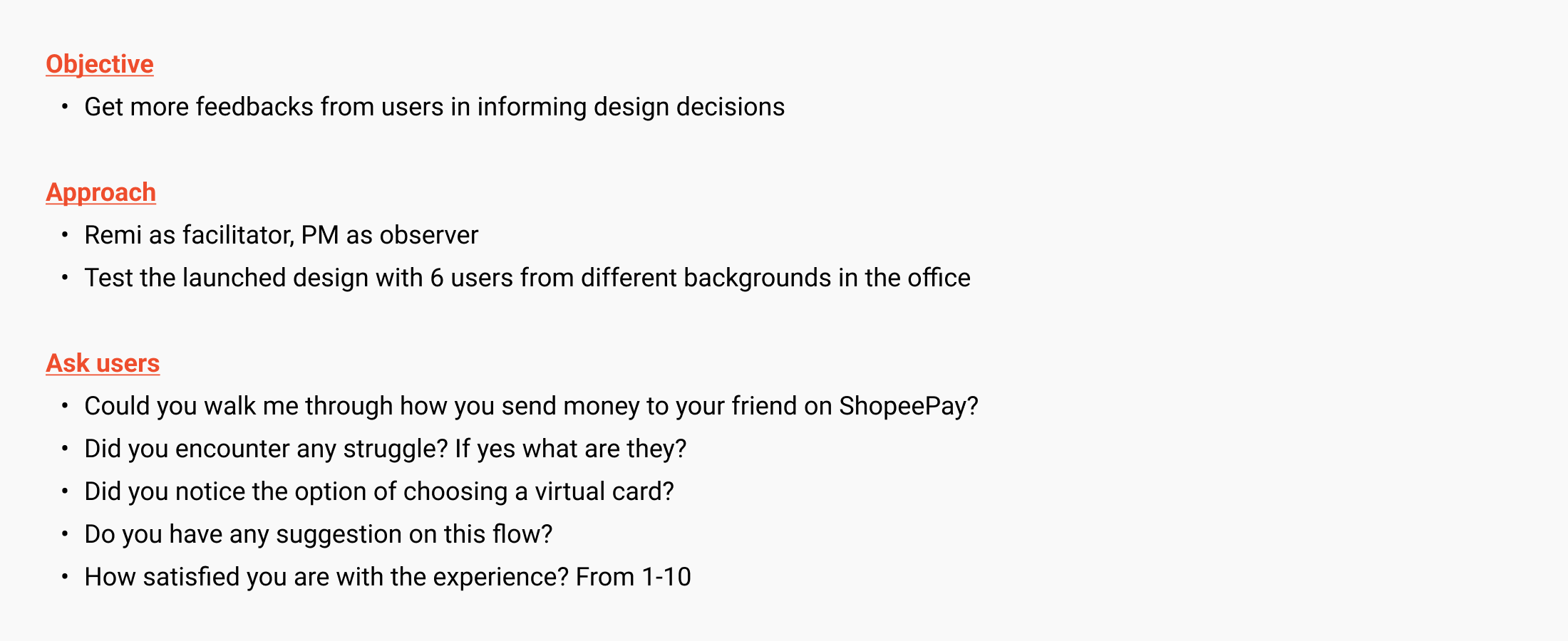
Key Findings
· Most users use ShopeePay for paying to merchant
· Some users didn’t use ShopeePay Transfer before
Why they didn't use the feature
· Low balance in ShopeePay
· Not sure if their friends are on ShopeePay
· Use other payment apps such as PayLah and GrabPay
Other obvious issues
· All users didn’t see the virtual cards
· Took a long time to load the contact list
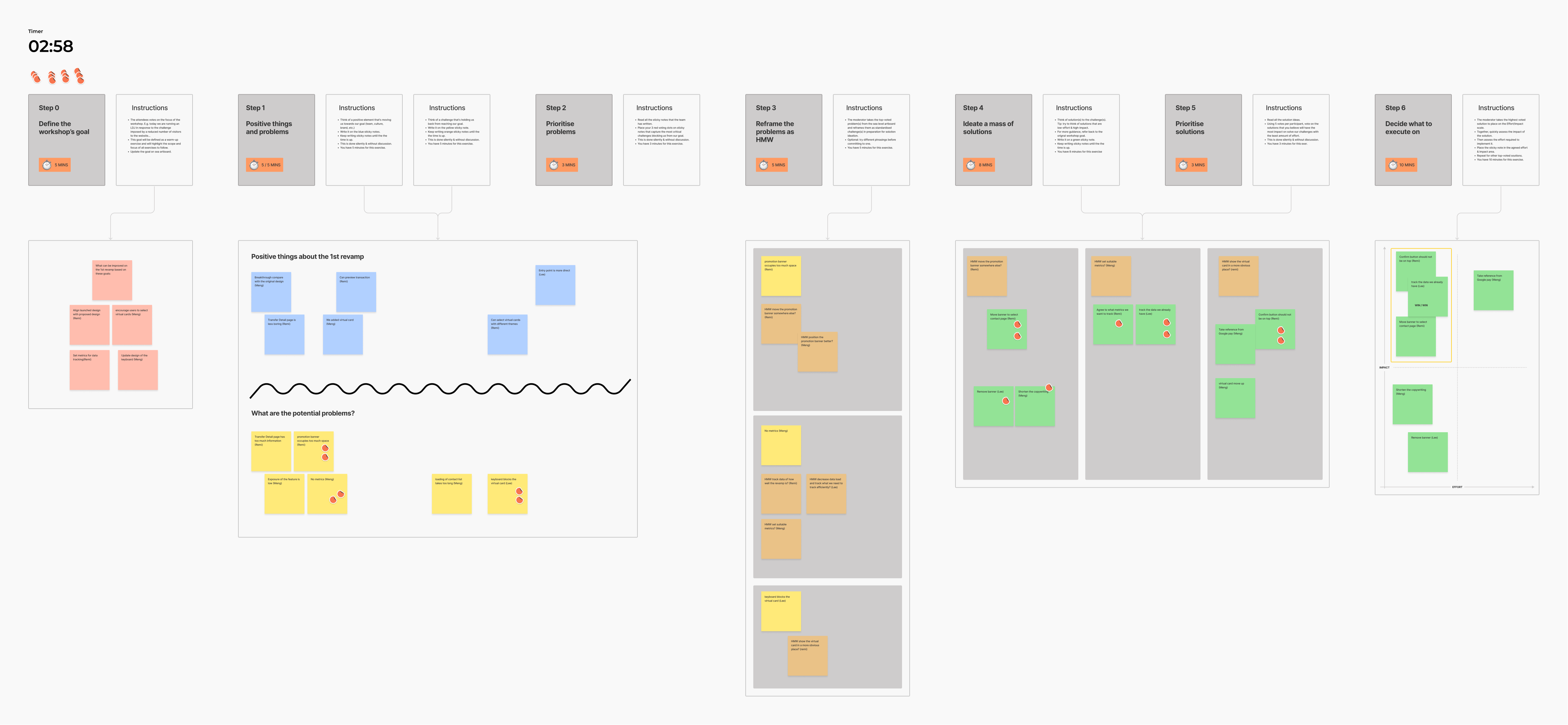
Lightning Decision Jam
After receiving feedbacks from the guerrilla usability testing, I hosted a lighting decision jam workshop with PMs and developers to identify the second revamp’s main goals, set metrics, brainstorm ideas and pick the ideas with the most impact and least effort. Here are the action items:
· Promotion banner can be moved to select contact page
· The virtual card selection should be more accessible
· Update the design based on the latest component library
· Allow users send money to non Shopee users e.g send to phone number
· Work with marketing team to increase ShopeePay Transfer awareness
· Track metrics: conversion rate, drop off rate, virtual card selection rate, NPS
Proposed Designs
I proposed two designs based on insights I got from the UI UX audit, guerrilla usability testing and the LDJ workshop. We finally decided to go with Design 2 because the layout is more interesting and modern.
Key Improvement
· The promotion banner was moved to contact page
· The UI is more fun and less formal
· The amount input field and message take less space
· No more repetitive and unnecessary information
· Selecting virtual card isn’t blocked by the keyboard
· The virtual cards don’t occupy as much space
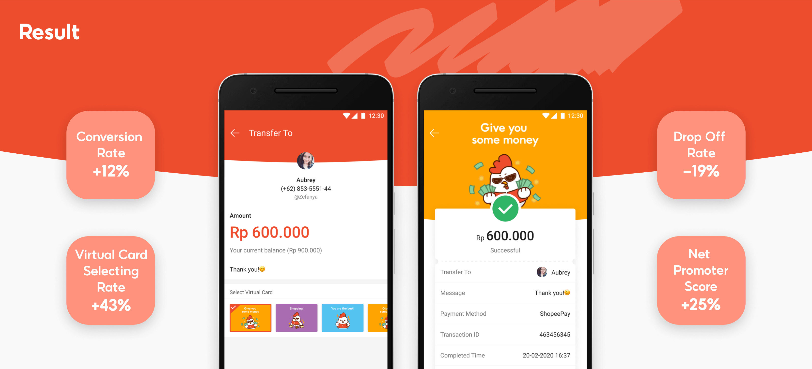
The Result
I was really content with the final result of the second revamp, we were able to see significant increase in conversation rate and more people select the virtual cards with data tracking. The next steps would be:
· Keep tracking data of how efficient the second revamp is
· Always do UI review before UAT
· Do another usability testing to uncover potential UX issues
· Ask the marketing team to prepare festival-related virtual cards
· Increase exposure of ShopeePay Transfer to users on Shopee app homepage and give rewards to loyal users
Learning
I definitely learned a lot from this ShopeePay Transfer revamp project. The project had its constraints especially on low UX maturity in the team, tight timeline and technical limitations, that's why I didn’t do much research to see what pain points we actually needed to solve at the first revamp. However, as the lead designer of ShopeePay, I always tried to take initiative to improve a design. I’m glad that I was able to get some very valuable feedbacks from the guerrilla usability testing and the LDJ workshop with my PM and the developers. The result was beyond expectation. I left the company not long after the project, but I truly hope this product can continue to succeed, acquire and retain more users in different markets.