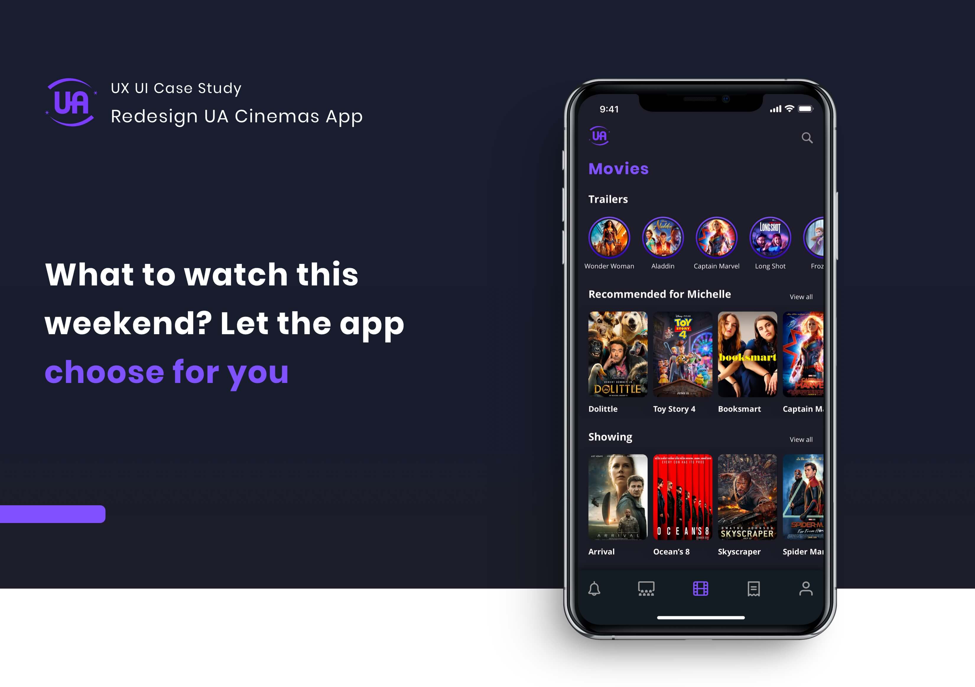
Designing a better cinema experience
Overview
What if your cinema app knows what you want to watch before you do? What if you can earn reward points by buying tickets through the app?
Many people love watching movies and going to cinemas. UA Cinemas is one of the most well-known cinema operators in Hong Kong. I've had their app for a long time, but I barely use it since there is a HK$10 service charge for each ticket purchased. This is a pain point that discourages users from buying tickets online.
Project
Design Case Study
My Role
Product Designer
Scope
Research, Persona, User Journey Map, User Flow, Wireframe, UI, Prototyping, Visual Design
Year
2020
The Challenge
After walking through the whole app, I saw some UX and UI problems that can be improved. I decided to turn the existing pain points into opportunities for both UA Cinemas and users. My high-level goals are:
· For UA Cinemas, I wanted to help them retain users and encourage users to buy tickets online.
· For users, I wanted to design a more pleasant experience in choosing the right movies and earning reward points.
Market Research #1
I started by looking at existing market research. According to the "Survey on Movie-going Habits in Hong Kong" conducted by the Television and Entertainment Licensing Authority, average Hong Kong people go to the cinemas 5 times a year. Regarding the types of movies, comedy was the most popular choice. The survey also revealed that imported movies were preferred over local movies.
Market Research #2
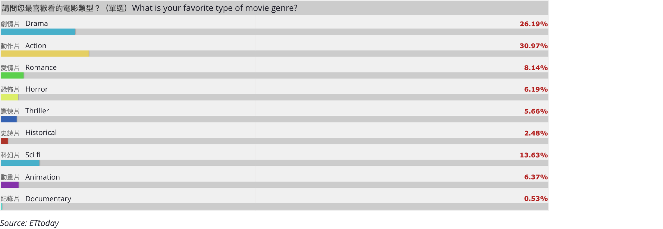
I found more market research that focuses on the types of movies people watch in Hong Kong. It shows that action films (30.97%) and drama films (26.19%) are the most popular types. While sci-fi films (13.63%) and romance films (8.14%) are also quite prevalent.
User Reviews
The user reviews of UA Cinemas on the App Store show me some major issues within the app, such as not being able to download the QR code to the Wallet app, not being able to see reward points and expensive service charges.

Face to Face User Interview
After looking at some market research to understand current users’ behaviours on movie-going, and user reviews on the app’s existing problems, I decided to dig deeper. I conducted a user interview with 6 people who went to UA Cinemas in the past year. These were the questions asked:
· What types of movies do you usually watch?
· Have you used the app to buy tickets before?
· What encouraged you to use the app?
· What discouraged you to use the app?
Key quotes from the users:

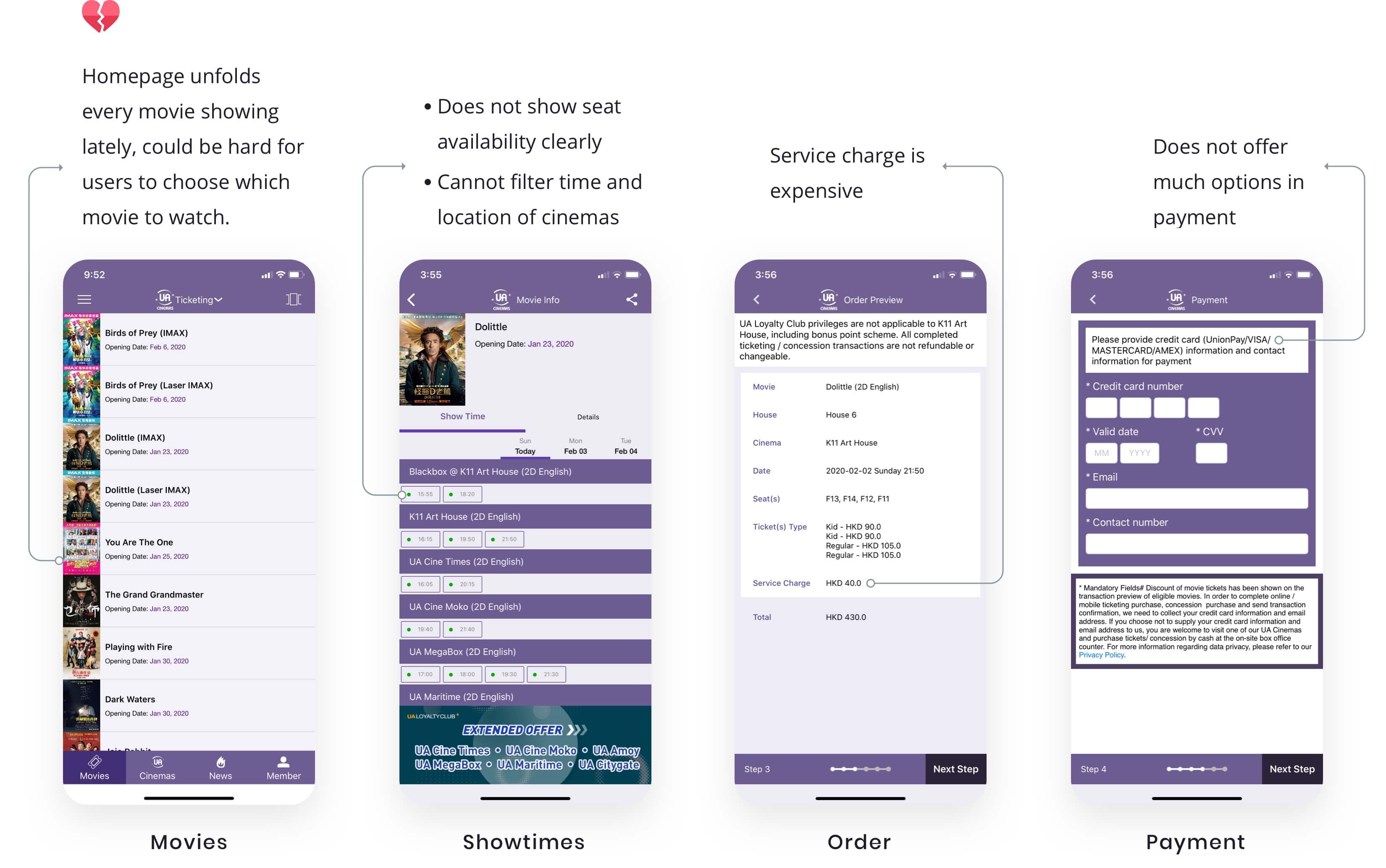
Pain Points of Existing App
Apart from the research I have discussed, I found the major pain points of the existing app are:
Persona
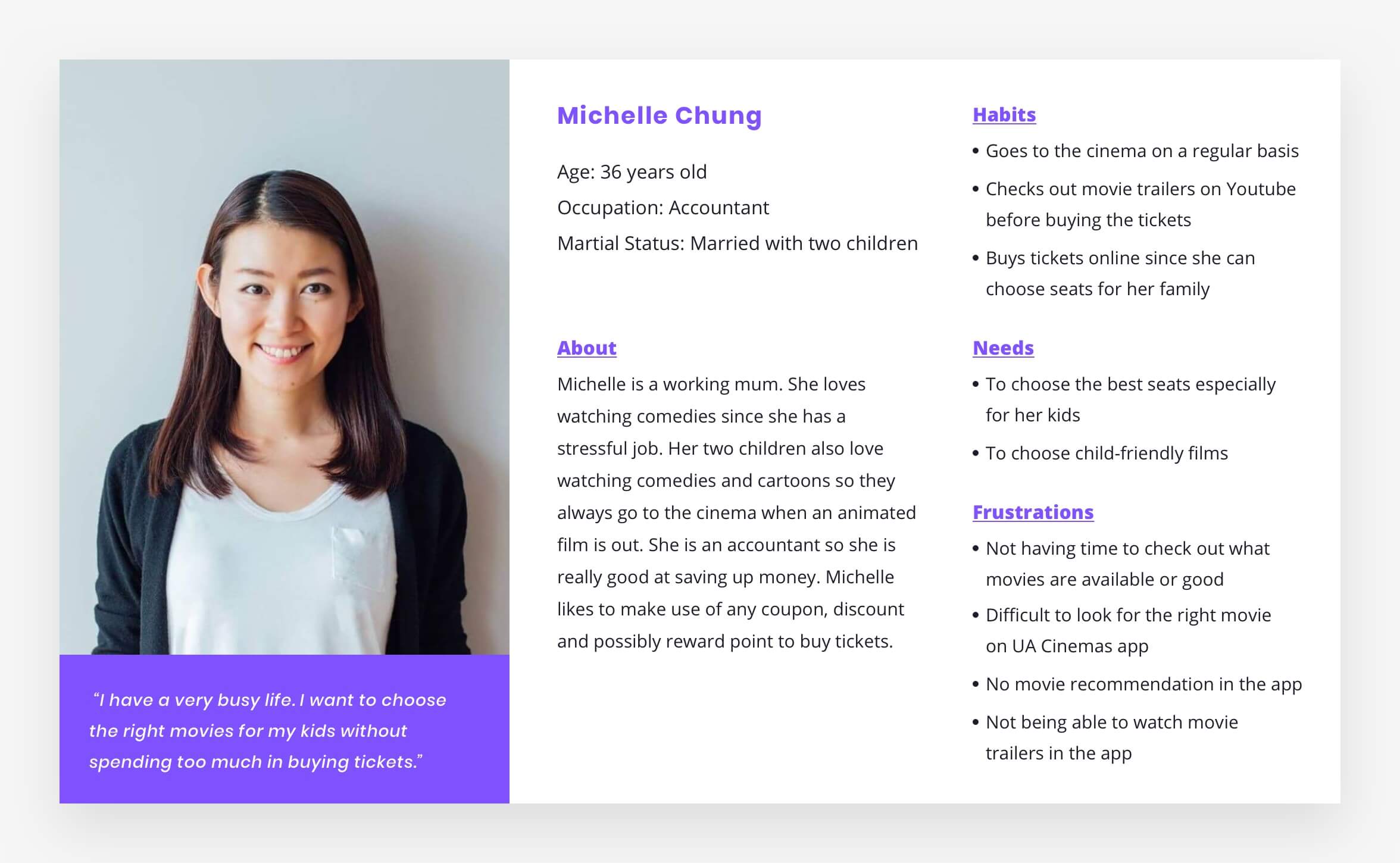
The results from the market research, user reviews, user interview and findings from the existing app provided sufficient information to create a persona. I wanted to design for the most common use case so I focused on one persona whose needs can be met by the new design.
User Journey Map
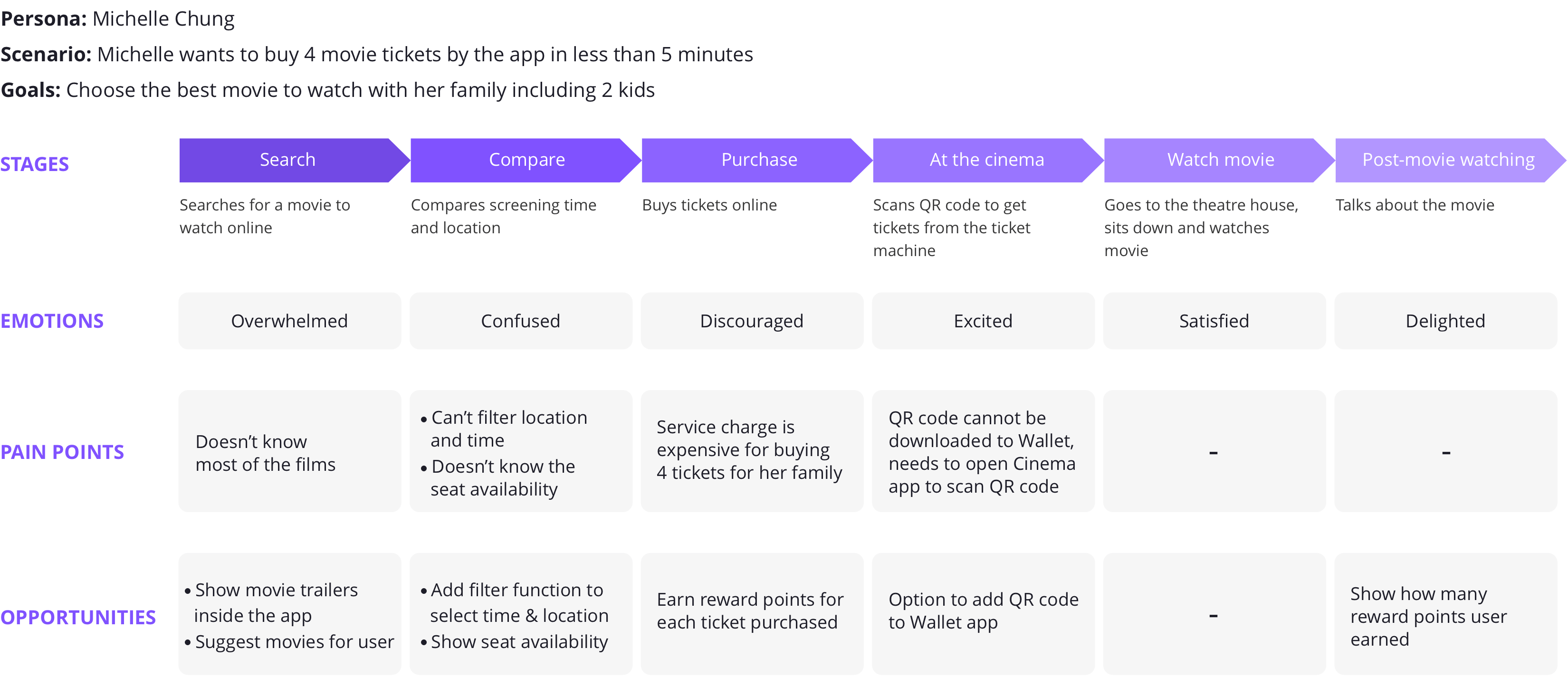
Next, I worked on a user journey map based on my persona, Michelle. This process helped me understand the user’s motivations, pain points and needs along the way, and how the redesigned app can help users. The journey map will focus on one scenario, which is how Michelle buys tickets online.
Ideation — User Flow
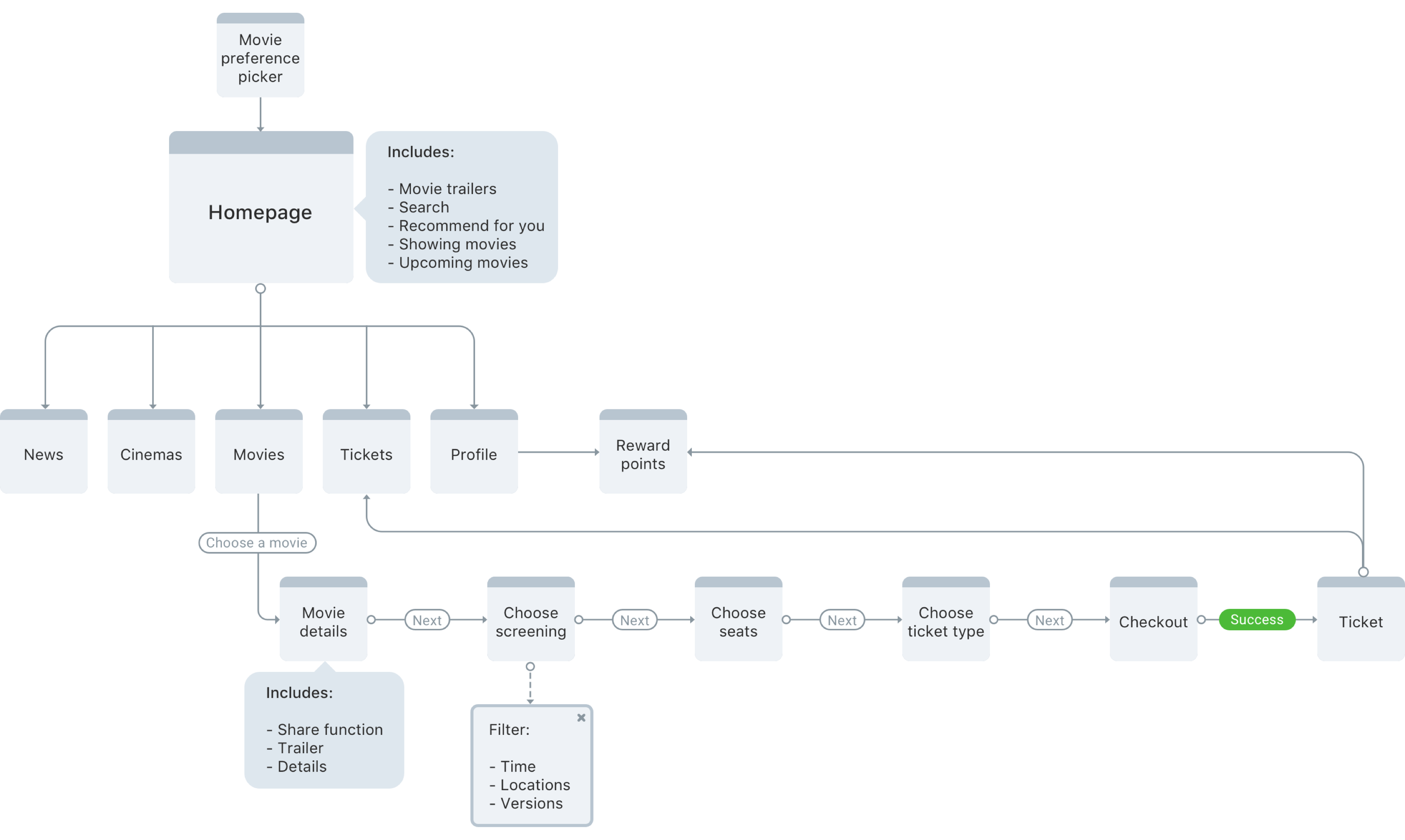
I like to start working on the user flow when I have some understanding on the user’s needs and pain points. The flow focuses on one scenario of the user wanting to buy movie tickets online.
Wireframe
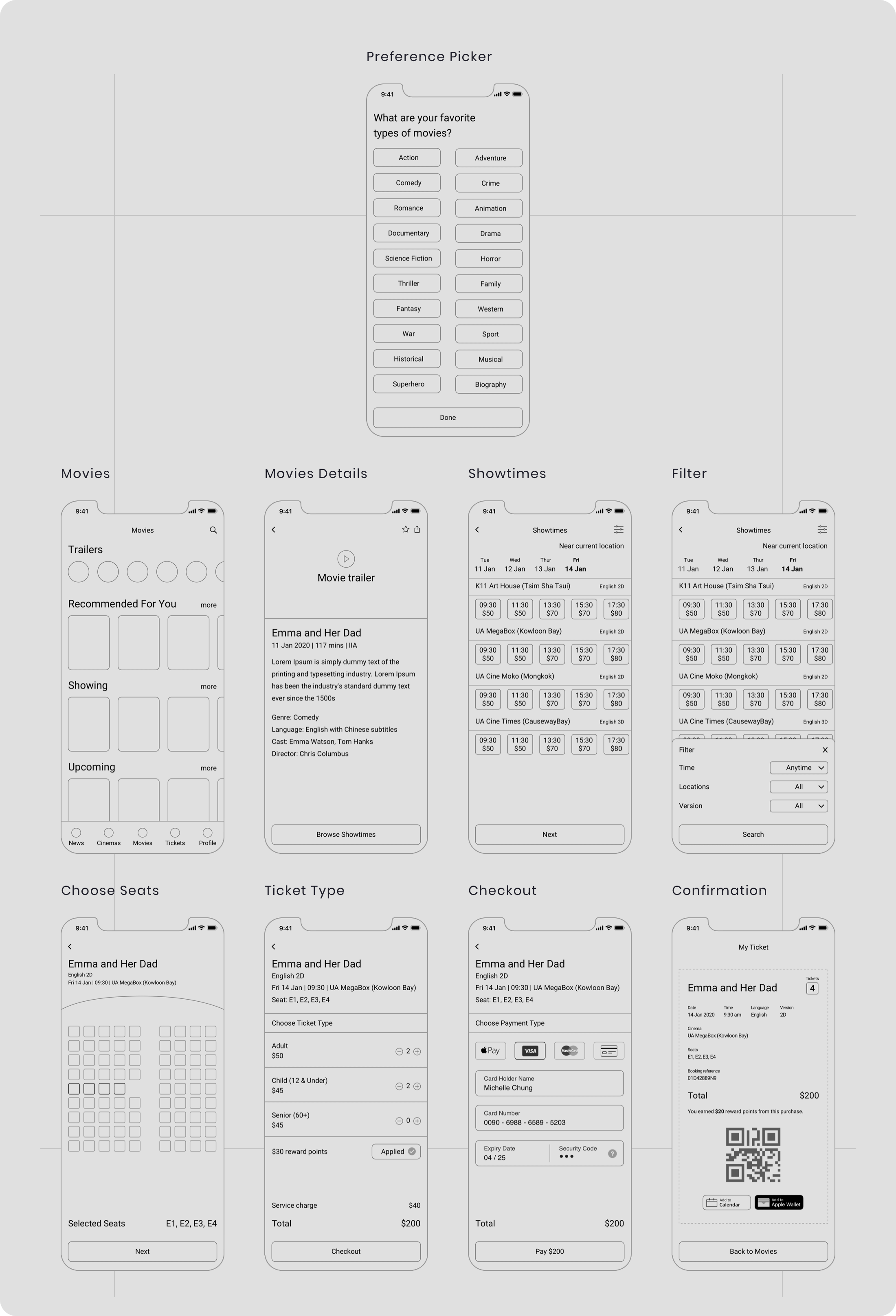
Wireframe is the skeleton view of the app and it allows me to focus on key functions and elements. I opted for a high-fidelity wireframe so I didn’t need to worry about the placement of components during interface design.
1. Onboarding: Preference Picker
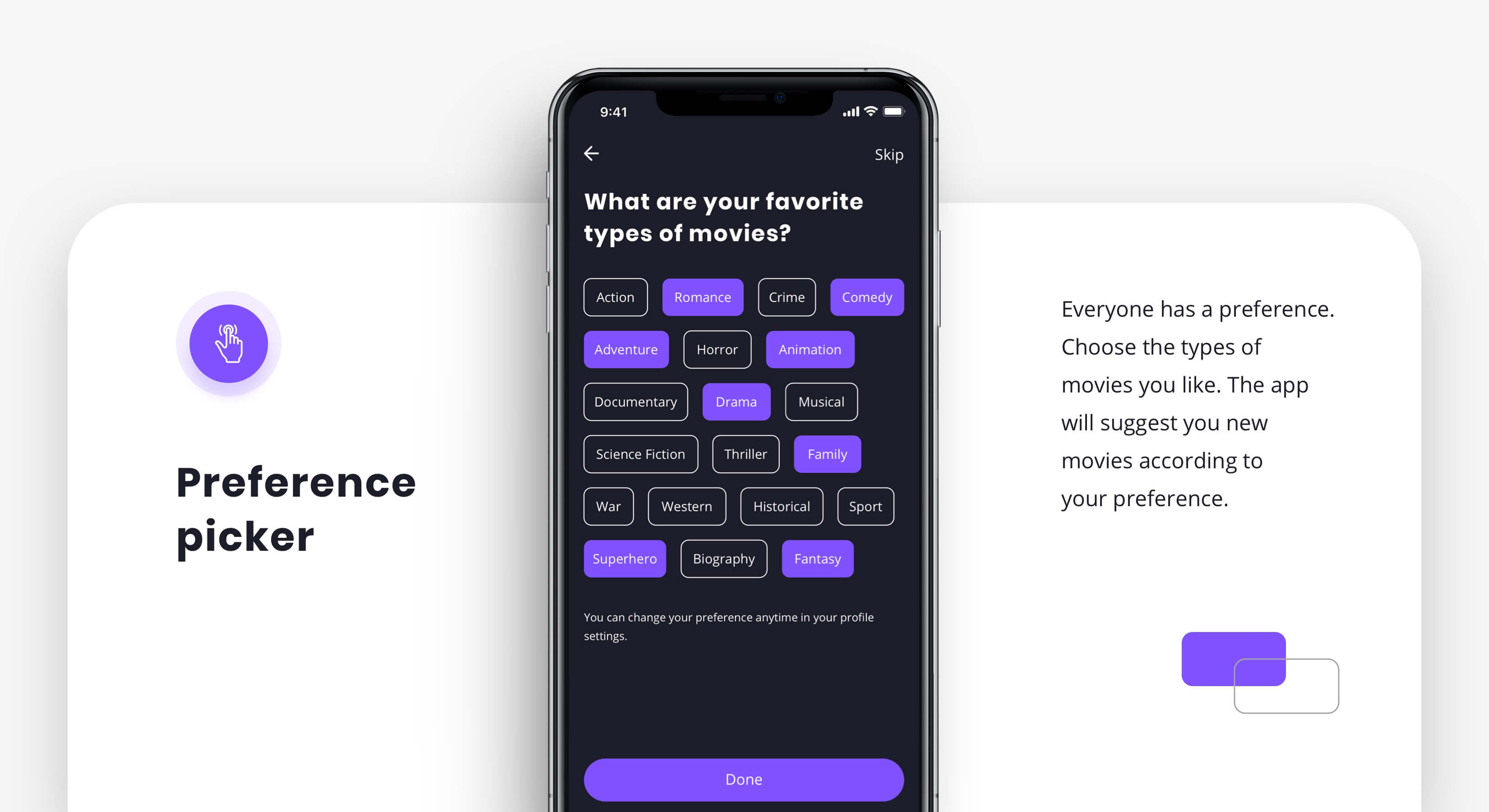
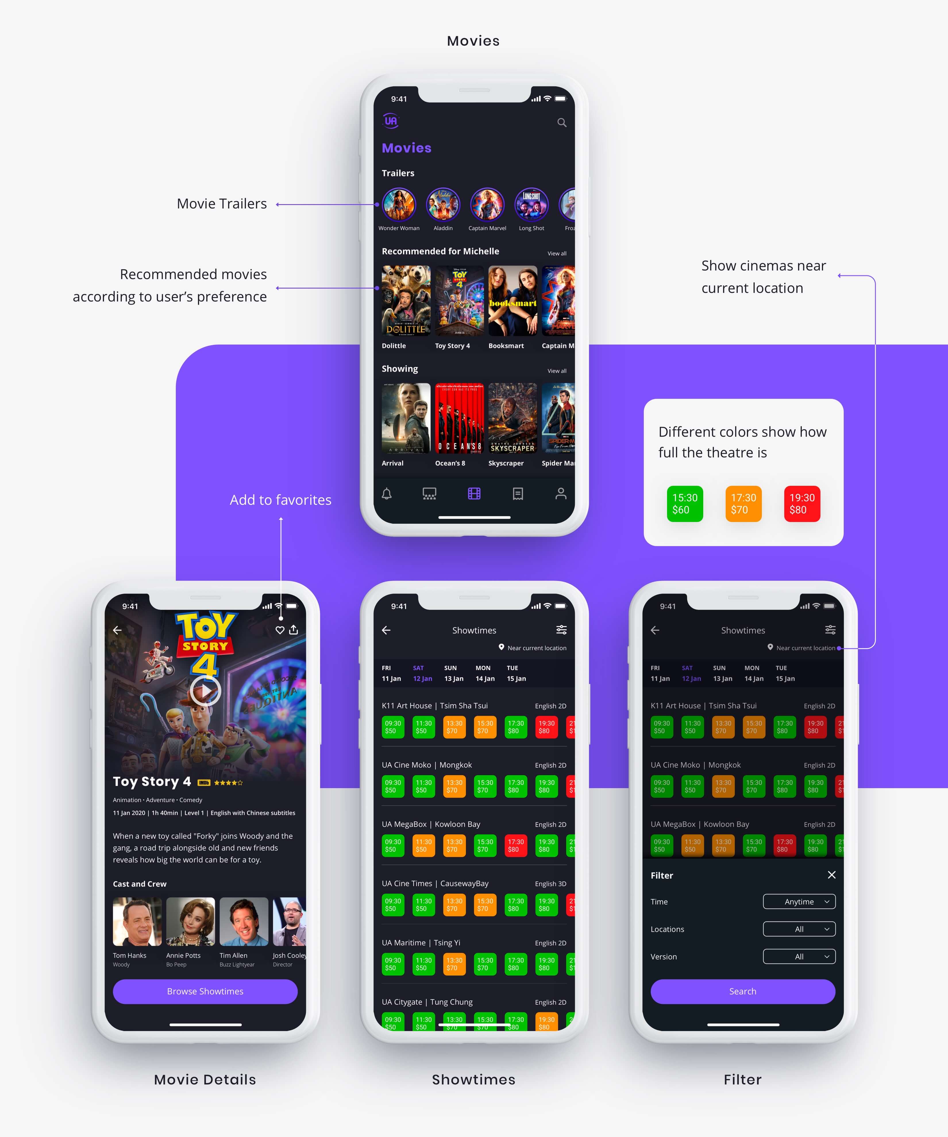
The first feature I added is the preference picker where users get to pick the types of movies they like to watch. For example, Michelle likes comedies and she likes watching family movies with her children. On the homepage, the app will suggest new movies to Michelle according to her preference.
2. Choose A Movie to Watch
According to the user research I discussed earlier, users have movie genre preferences. On the homepage, the app recommends new movies according to what users chose during onboarding. Users can also watch trailers of the movies they are interested in on top of the homepage. Inside movie details, I attached information and pictures of the cast and crew, users can choose the movie which has their favorite actor or actress.
When users browse the showtimes, three colors represent different seat availability. Users can choose a movie that is the most suitable for their own schedules. The filter function also helps them pick the right screening time and location wisely.
3. Checkout by Using Reward Points
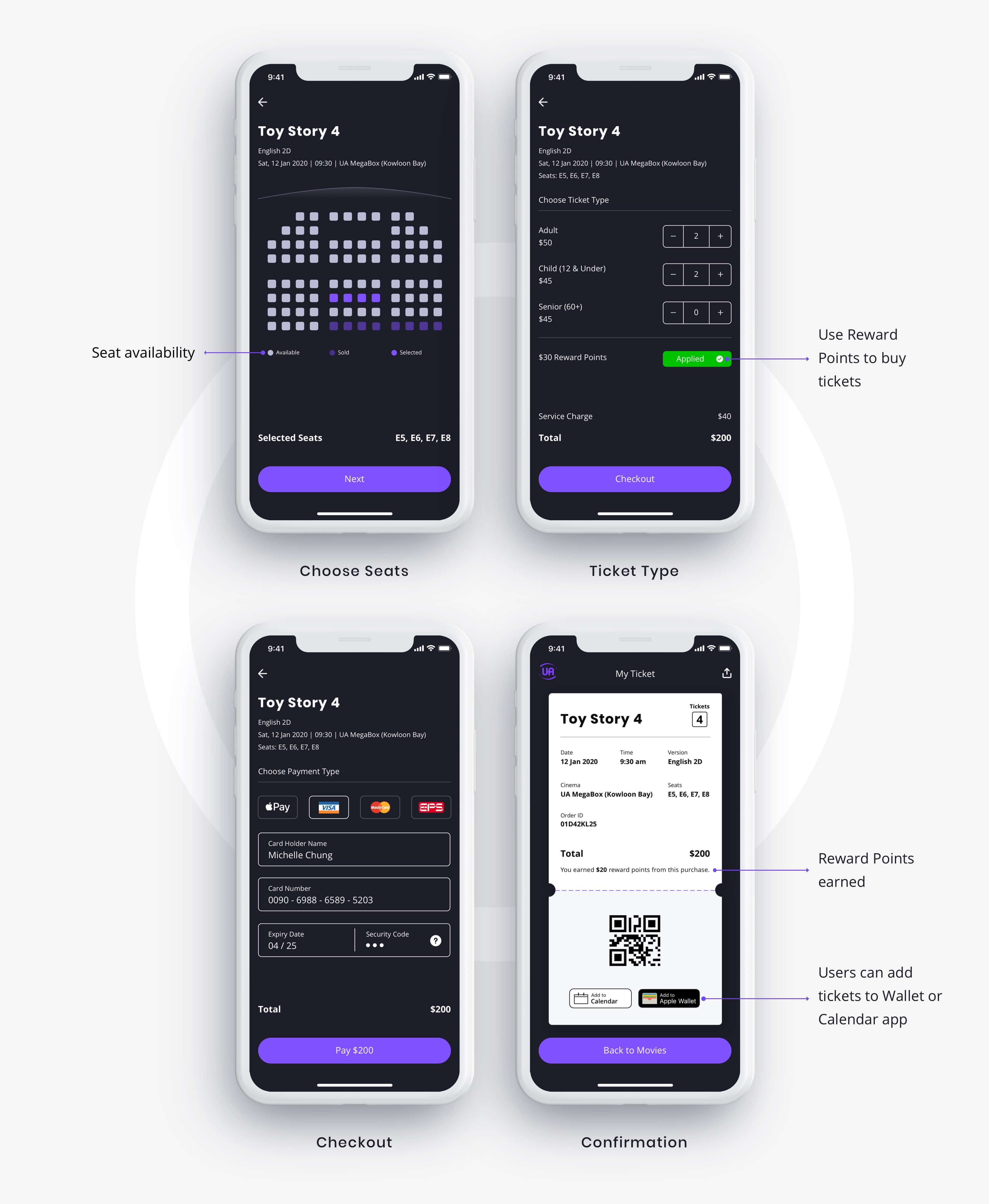
One major pain point I stated earlier was users found the service charge a deal breaker. With the new design, users can use reward points to buy tickets after choosing seats. More payment options, such as Apple Pay, is available compared with the existing app.
On the confirmation page, users can download the QR code to the Wallet app and add it to the Calendar app. When entering the cinema, users just need to scan the QR code from any of these apps. They can also see how many reward points they earned per purchase.
Prototype
I used Flinto for prototyping. I applied some simple transitions between screens so users can focus on the app’s flow and functionality.
Visual Design
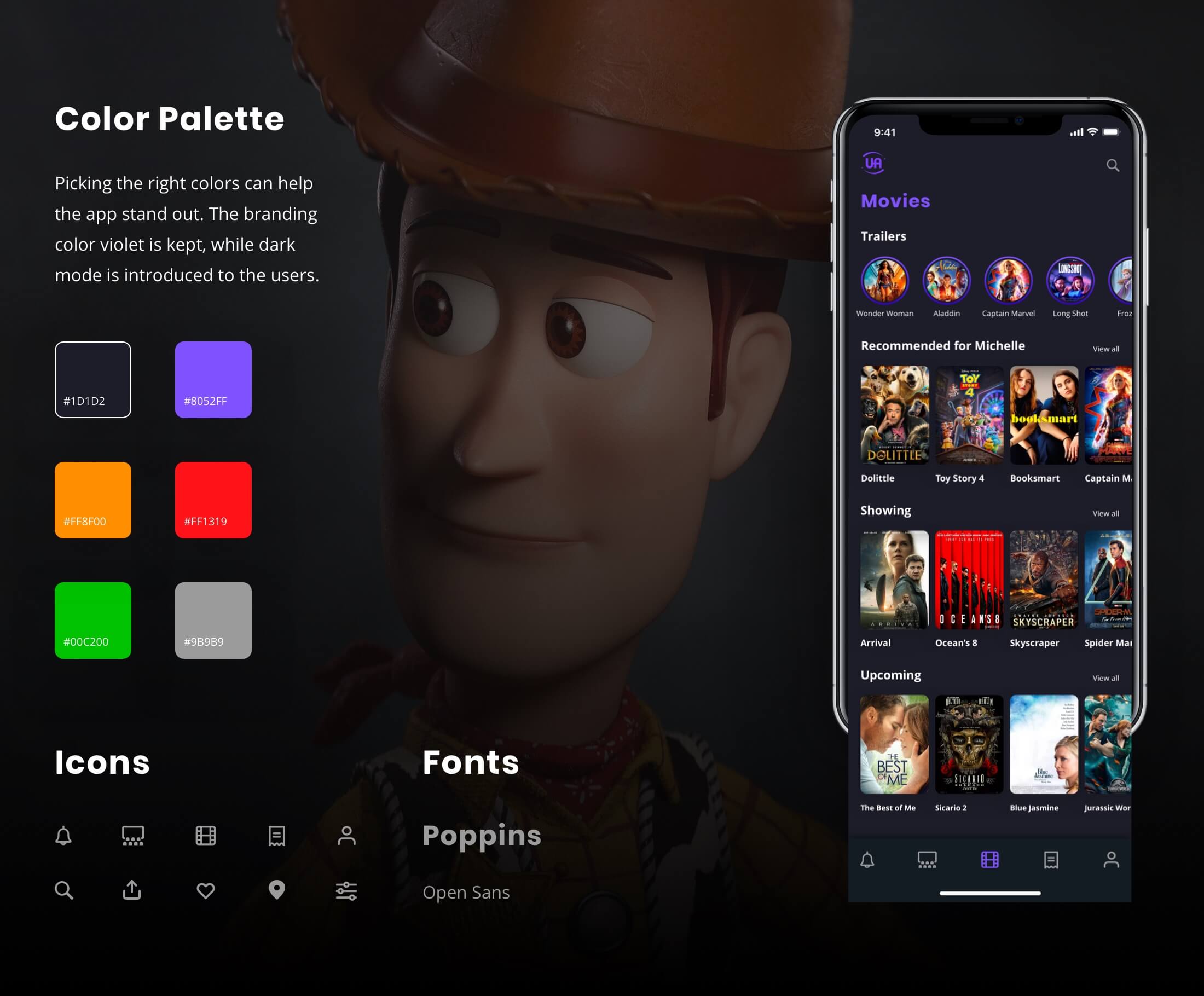
Violet is the branding color of UA Cinemas. I noticed there are different tones of violet on their website and posters, so I bravely chose this light violet for the new design. I also introduced dark mode to the app. Apple says that dark mode is “easy on the eyes” for users. It is the latest tech design trend which makes the interface more modern and targets to the app’s main user group, the millennial.
Learning
Designing the app has been an exciting and rewarding journey. I am a huge movie fan but I don’t go to the cinemas regularly because of the cost. Going through different user research helped me better understand user’s needs and pain points of watching movies in the cinema. My next step would be testing the prototype with real users. Insights from a usability test can provide me enough data on iterating the design, improving the app’s user flow and overall experience.
Final Thoughts
Hong Kong has one of the largest and most dynamic film entertainment industries in the world. However, with the growth of movie streaming platforms, fewer people go to the cinemas. My original goal of redesigning this app is to provide a pleasant experience for users when choosing a movie to watch, buying tickets online without spending too much and increase customer loyalty. It is my hope that this app will be supported by the cinema operator, and they will understand that users do like to go to cinemas, but they also wish to see a product that can help them make better choices and save their time and money.
