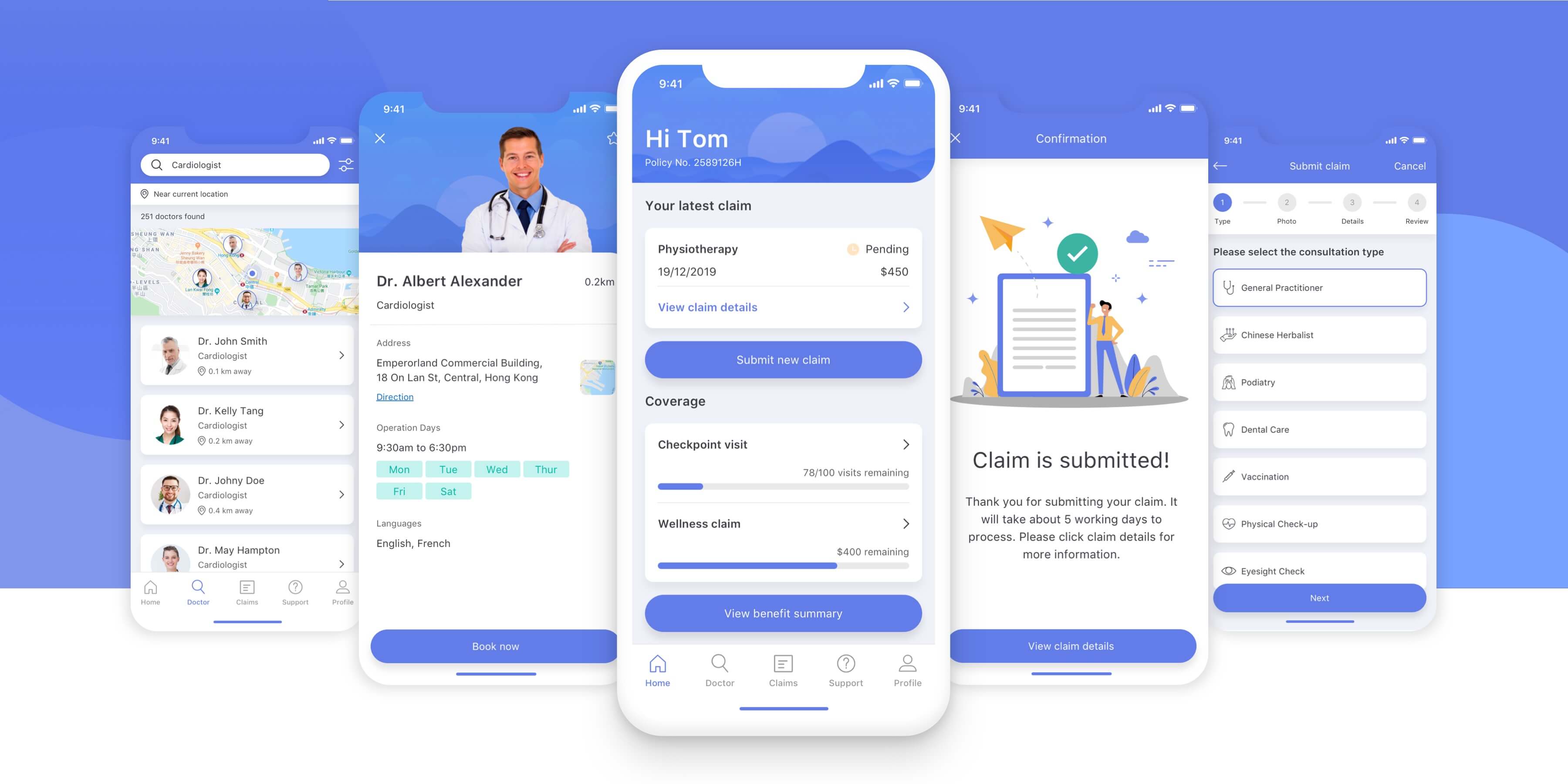
MyAXA Hong Kong App Redesign
Overview
Most people need medical care at some point. Having an easy to use health insurance app allows you to make a claim, find a good doctor and see everything in one place. The redesigned MyAXA app is a smarter, simpler, and more convenient app that allows you to take charge of your health care and benefits.
Project
Design Case Study
My Role
Product Designer
Scope
Research, Interview, Affinity Mapping, Jobs to Be Done, User Flow, Wireframe, UI, Visual Design
Timeline
2 weeks in Dec 2019
Problem
AXA is one of the biggest insurance firms in Hong Kong, it is well known for its health products and it serves over 1.3 million customers in the region. I am also covered by their Group Medical Insurance, so I used the app to file my first claim.
When I found the app I was surprised by the rating. It has a 1.9 out of 5 stars rating on the App Store. I was able to file my claim but the experience wasn’t pleasant. The menu structure is unclear, and I couldn't see my claim record after filing the claim. I noticed the app was only updated 7 months ago. So I determined to bravely redesign it.
User Research — User Reviews
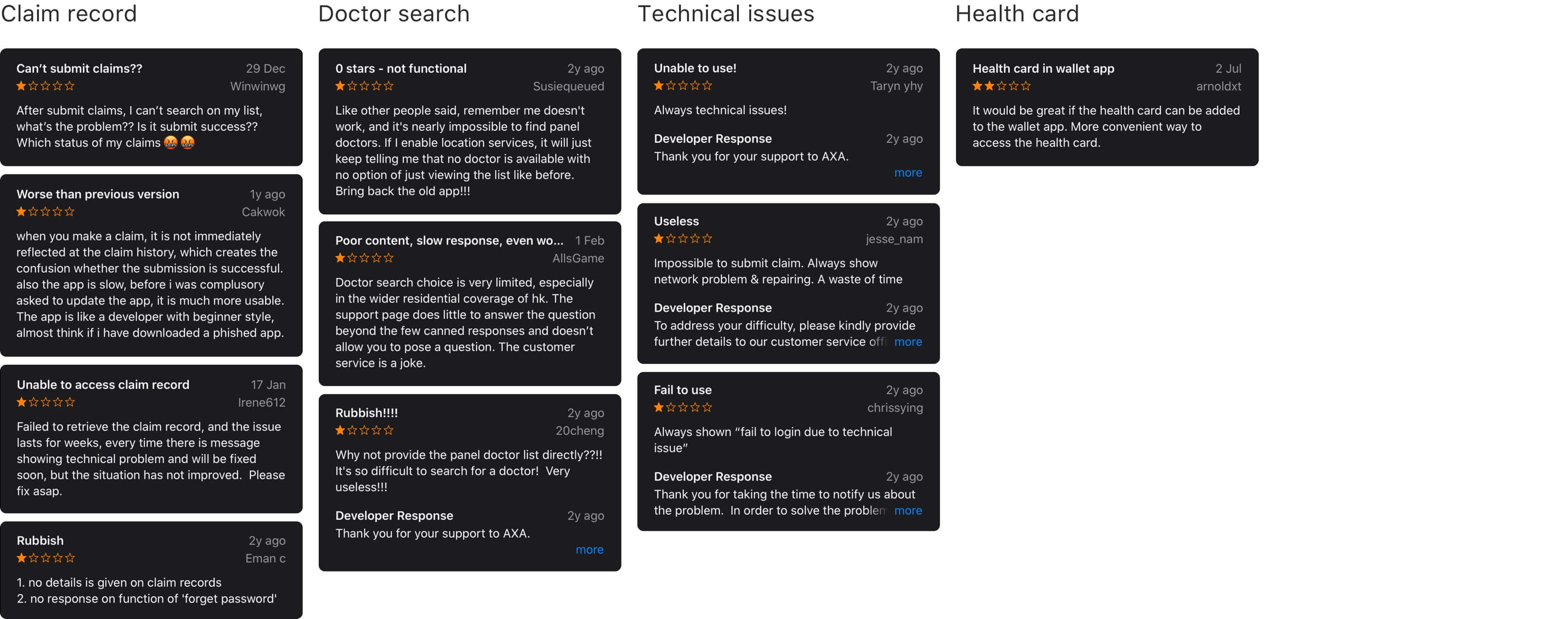
I first looked into the reviews on the App Store to have a general idea of what the existing users think about the app. The reviews generally highlighted issues about usability and functionalities.
I've categorized the reviews into 4 groups. The most relevant concern is being unable to see the claim status, users want to see if their claim is successful or not. The second most obvious issue is that the process of looking for panel doctors is difficult.
User Research — Face to Face User Interview
To better understand users’ needs and pain points, I interviewed 8 current users who used the app at least once in the past six months. I asked them:
· What do you usually do with this app? Can you show me?
· What are the frustrations (if any) you felt in the process?
· What’s most appealing about this app?
· What’s the hardest part of using this app?
· What could be done to improve this app?
Affinity Map — Key Takeaways
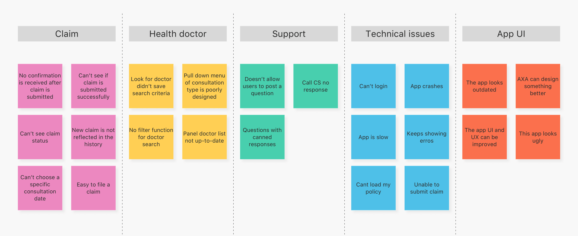
I used an affinity map to categorize different responses from the user interview. Here are the takeaways:
· 63% users would like to see the claim status right after they file a claim
· 50% users encountered issues with looking for AXA panel doctors
· 50% users don’t like the user interface
· 38% users aren't happy about the support and customer service
· All users have encountered technical issues when using the app
Pain Points
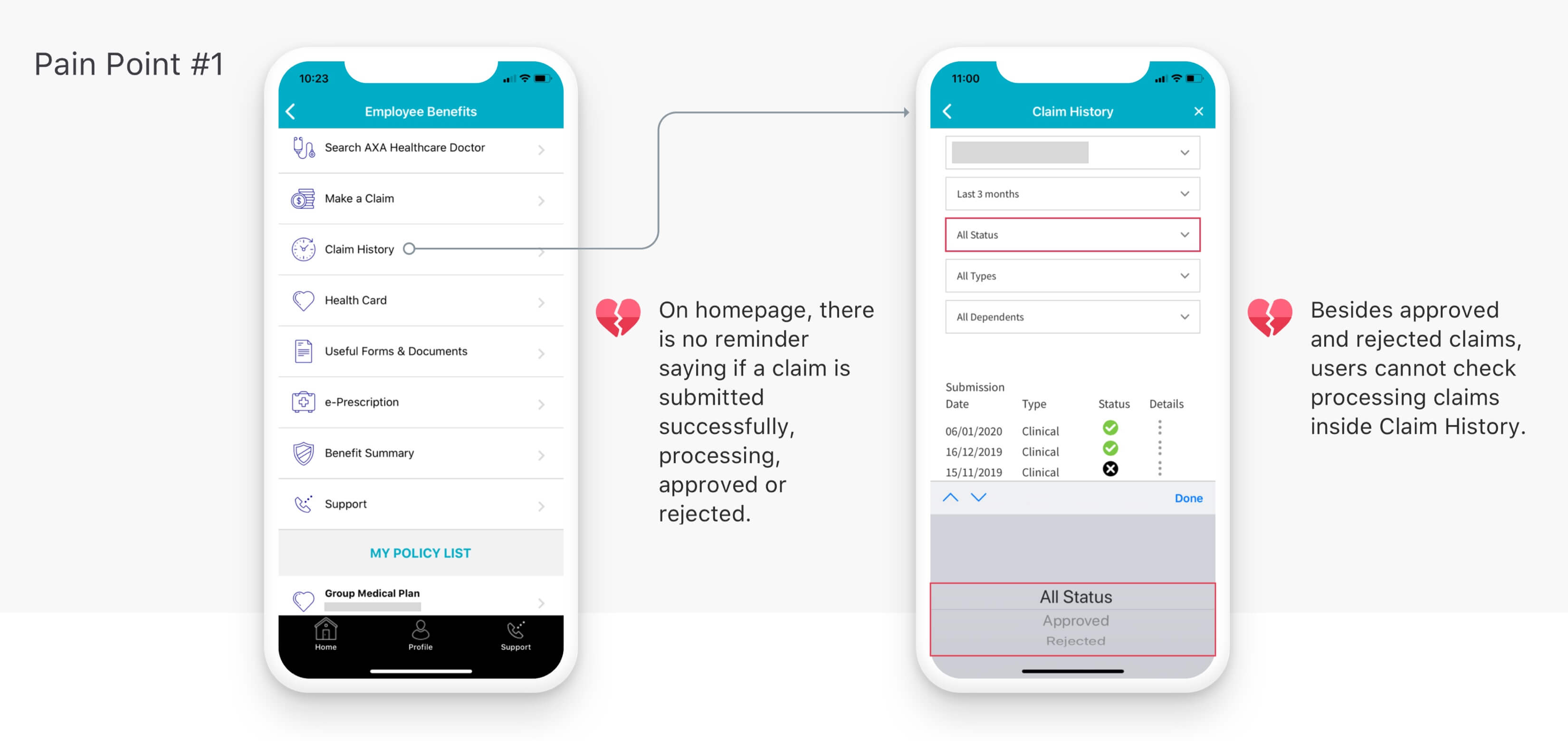
Summarising the research I have discussed, I found the major pain points that could be solved by a new design are:
Pain Point #1 Users can't track the claim record
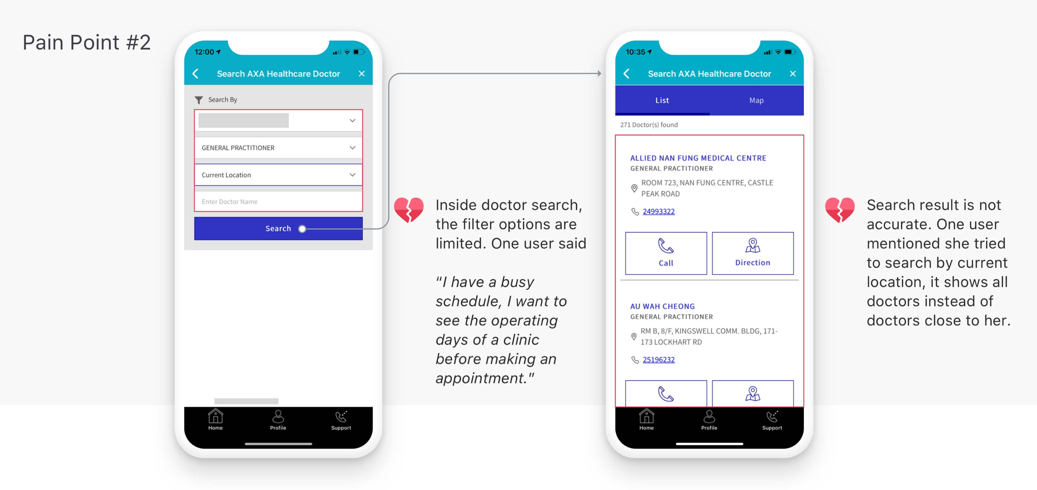
Pain Point #2 It's not easy to look for the right AXA panel doctor
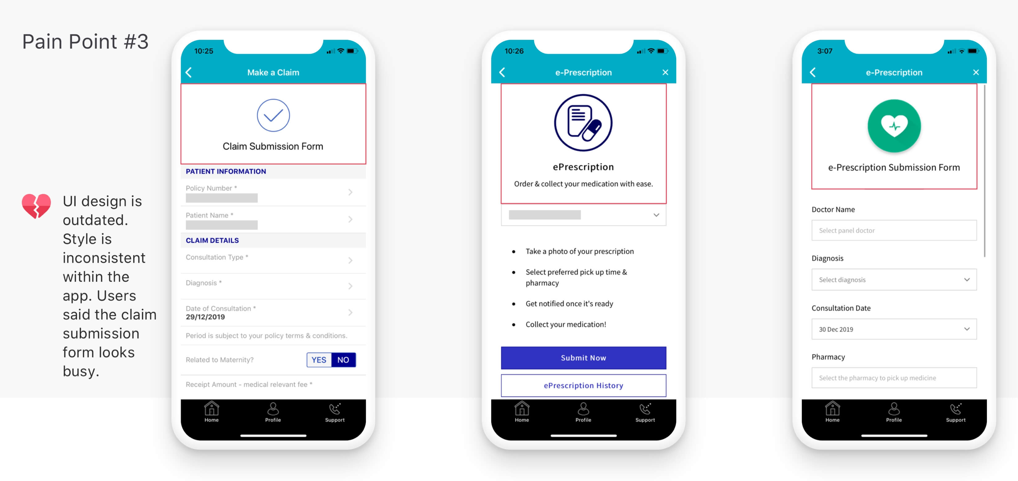
Pain Point #3 The current UI design is outdated
Jobs to Be Done
Based on the pain points from my user research, I identified three jobs-to-be-done so I could keep my focus and find solutions for the following:

User Flow
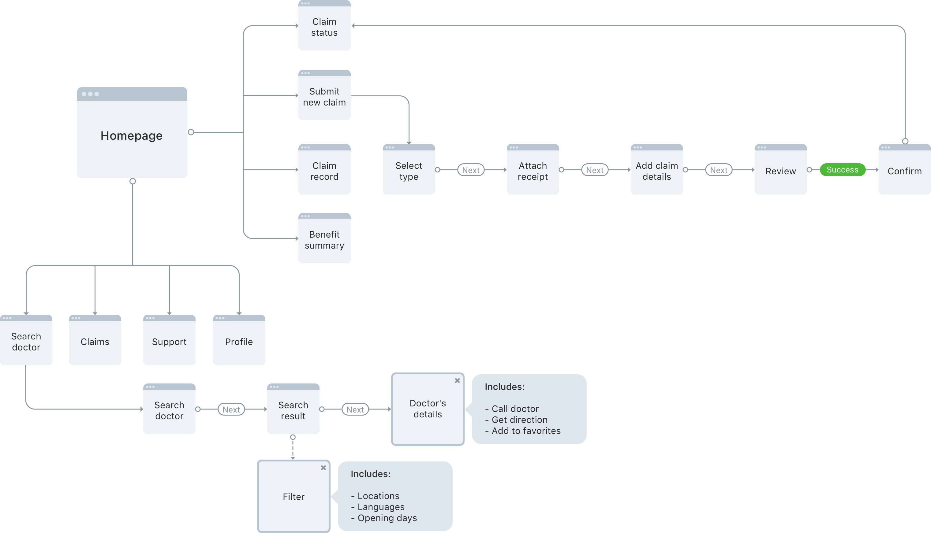
Mapping the basic flow of the app helped me figure out every step users take to go through those three jobs-to-be-done, and to assess the efficiency of the design I was creating.
Solution
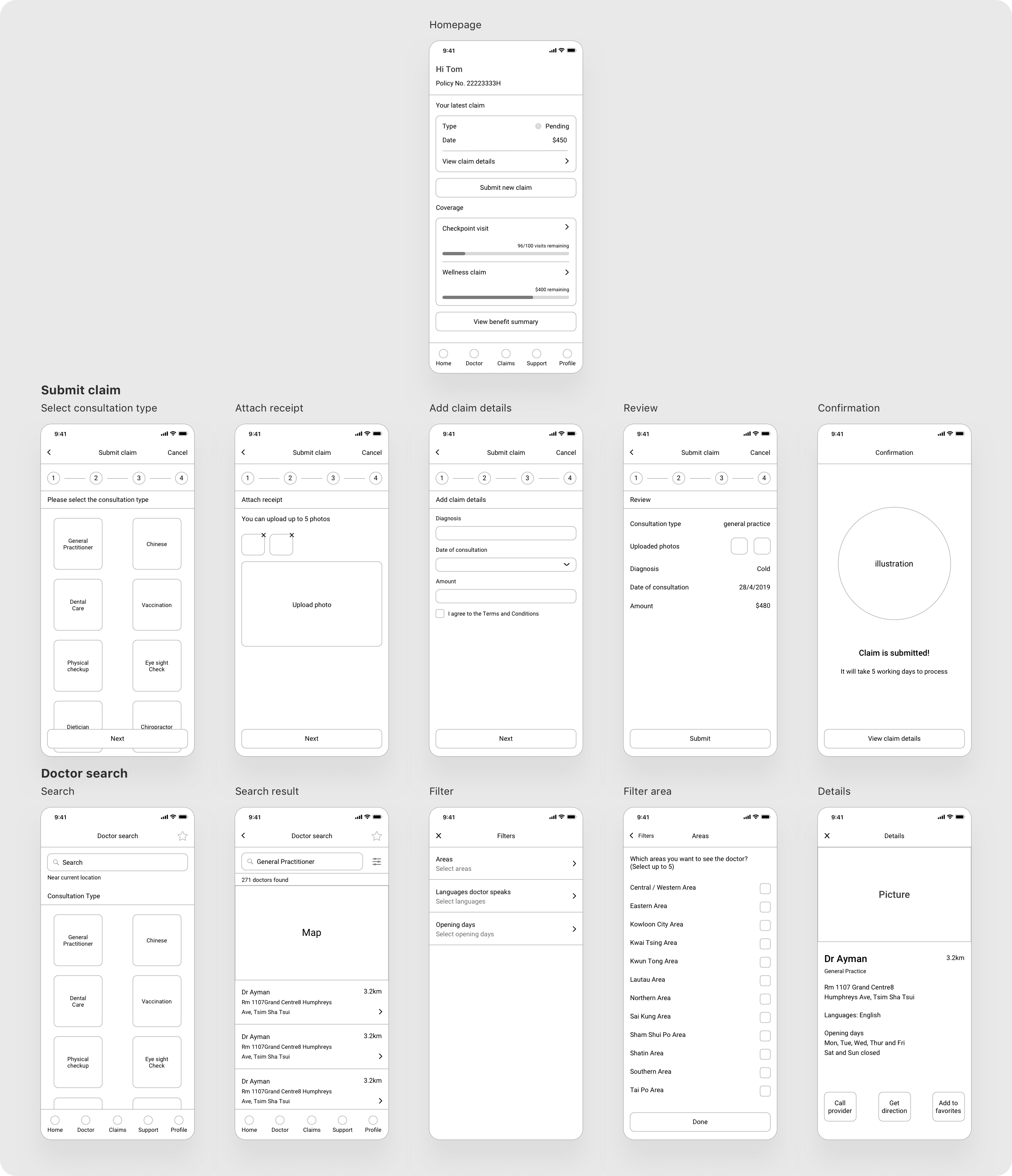
I realized most of the pain points can be solved with a clearer menu structure and an updated UI design. I started with making the wireframe of the app. It helped me arrange different components while I focused on the functionality rather than how it looks like.
1. Homepage
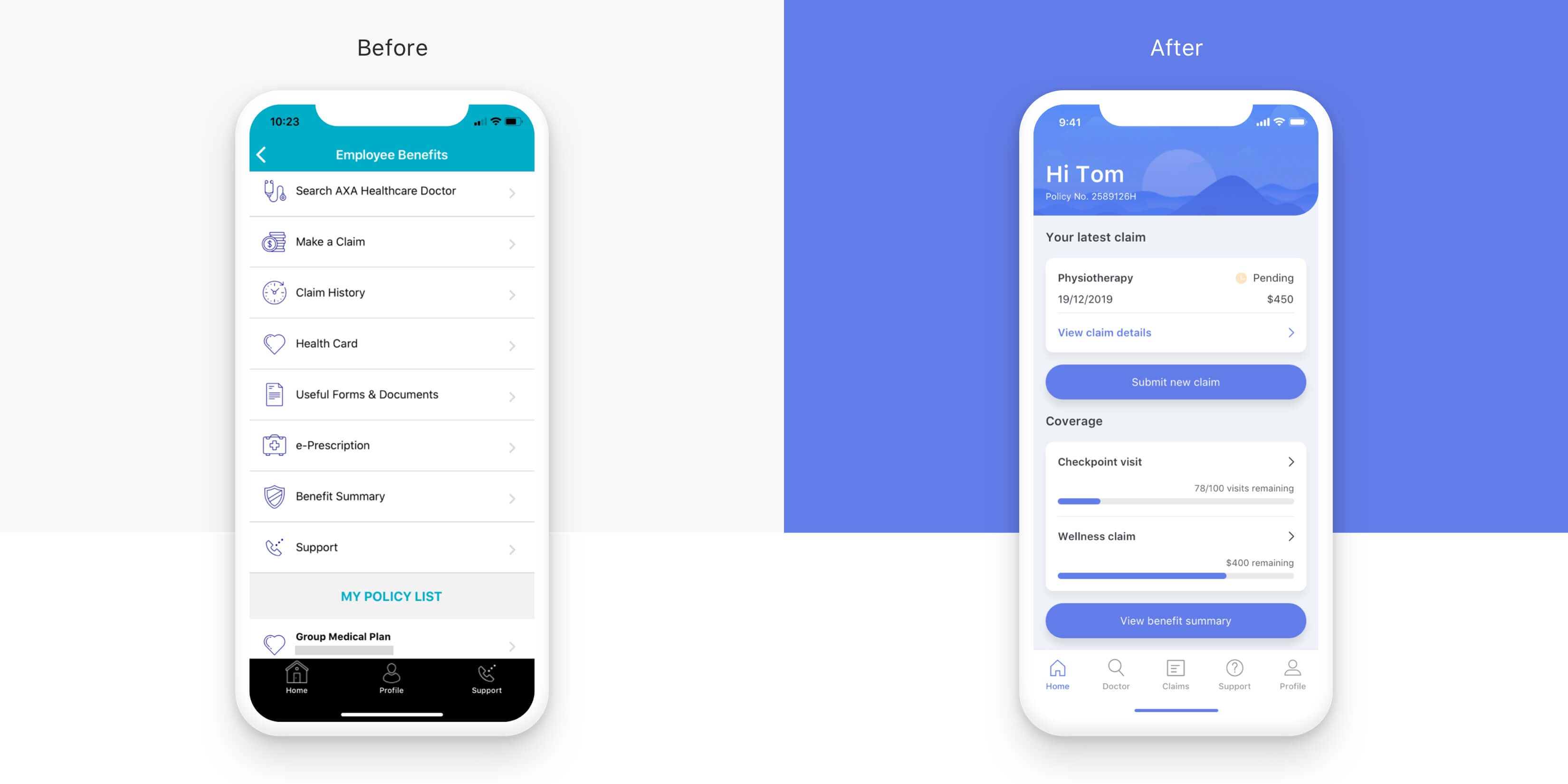
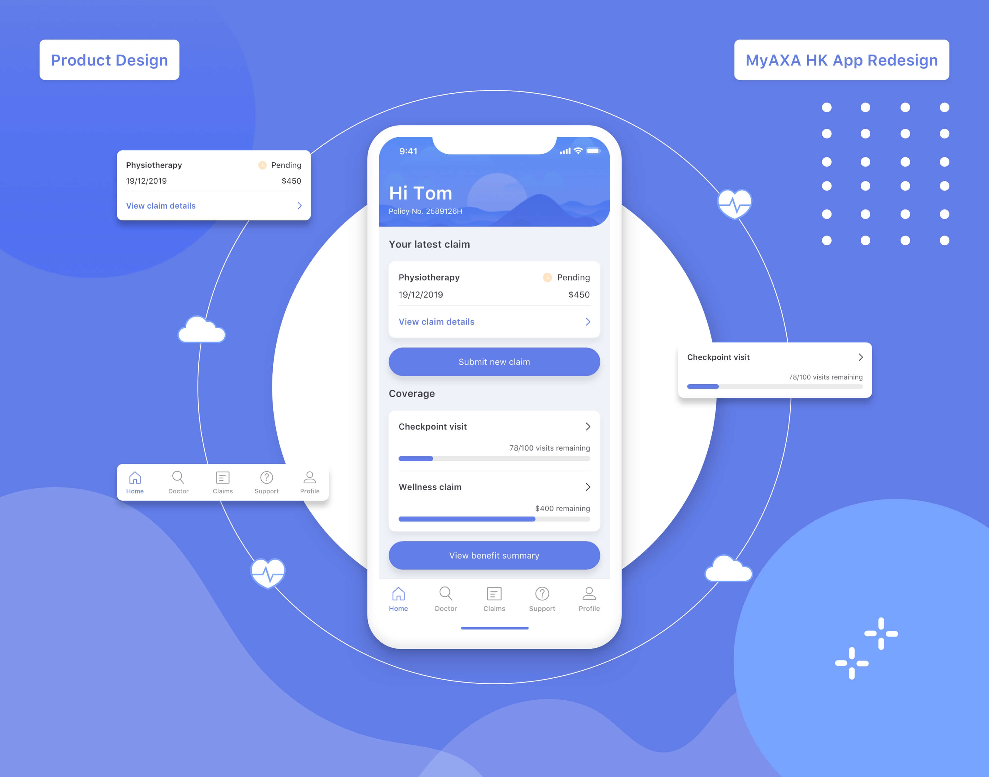
Overall, I’ve made many changes to the homepage. I modified the corporate blue color of the original app and made it more approachable and gentle. I also updated the UI and information architecture to improve the look and usability.
The Problem
The biggest challenge of the original app was the menu structure. The homepage unfolds every item regardless of hierarchy and category. It was difficult for users to find what they were looking for. Also, based on the user research, one of the biggest pain points was not easy to track claim records and can't see claim status.
The Solution
I put “Your latest claim” as the main feature on the homepage, users can check if their claim is processing or successful instantly while claim details are just one click away. Under “Coverage”, users can also see how many checkpoint visits are left and how much they can still claim.
As for navigation, I’ve designed a new tab bar. I put “Doctor”, “Claims” and “Support” in the middle so users can quickly jump to the features even they are on other pages.
2. Make a Claim
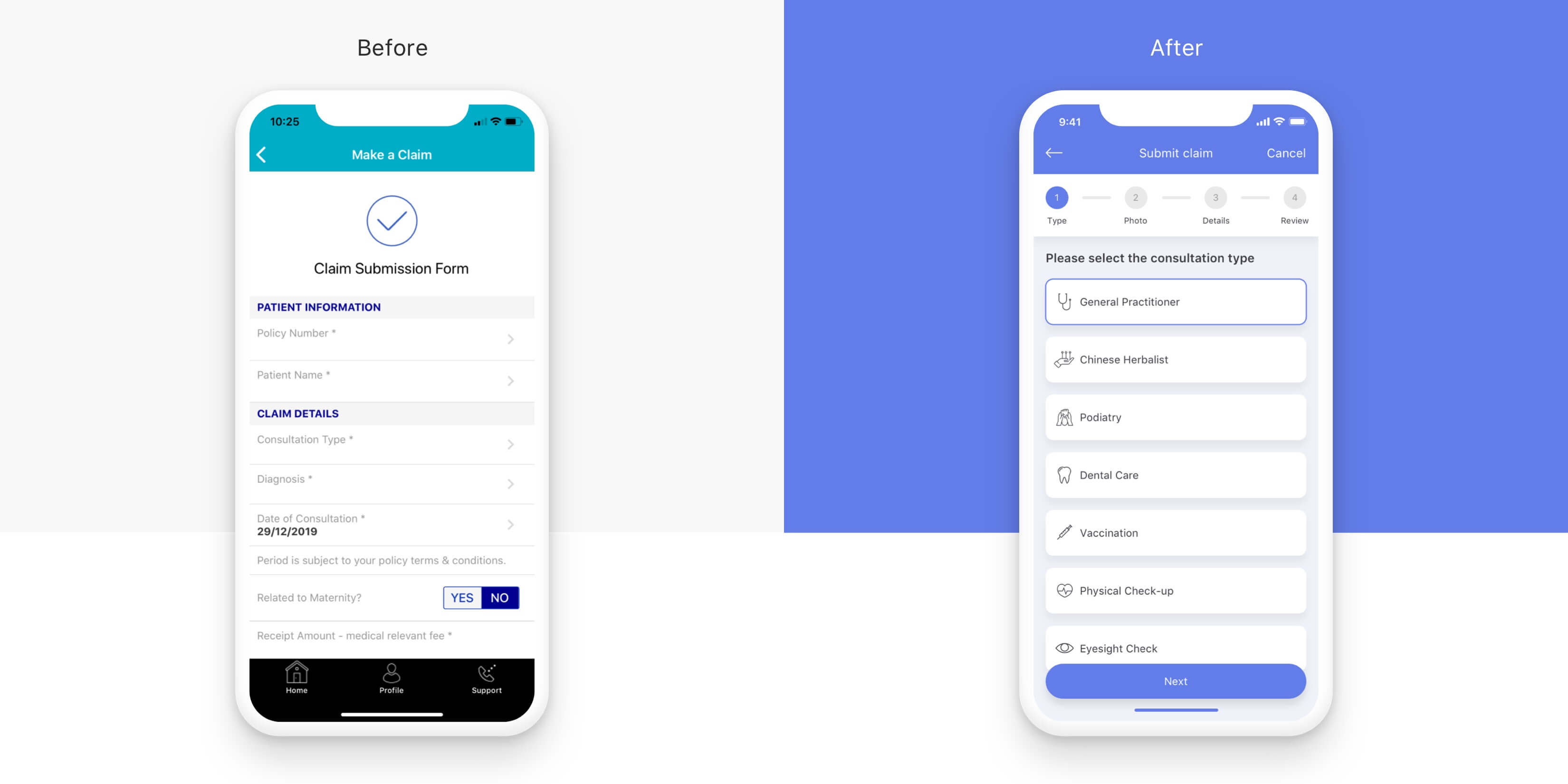
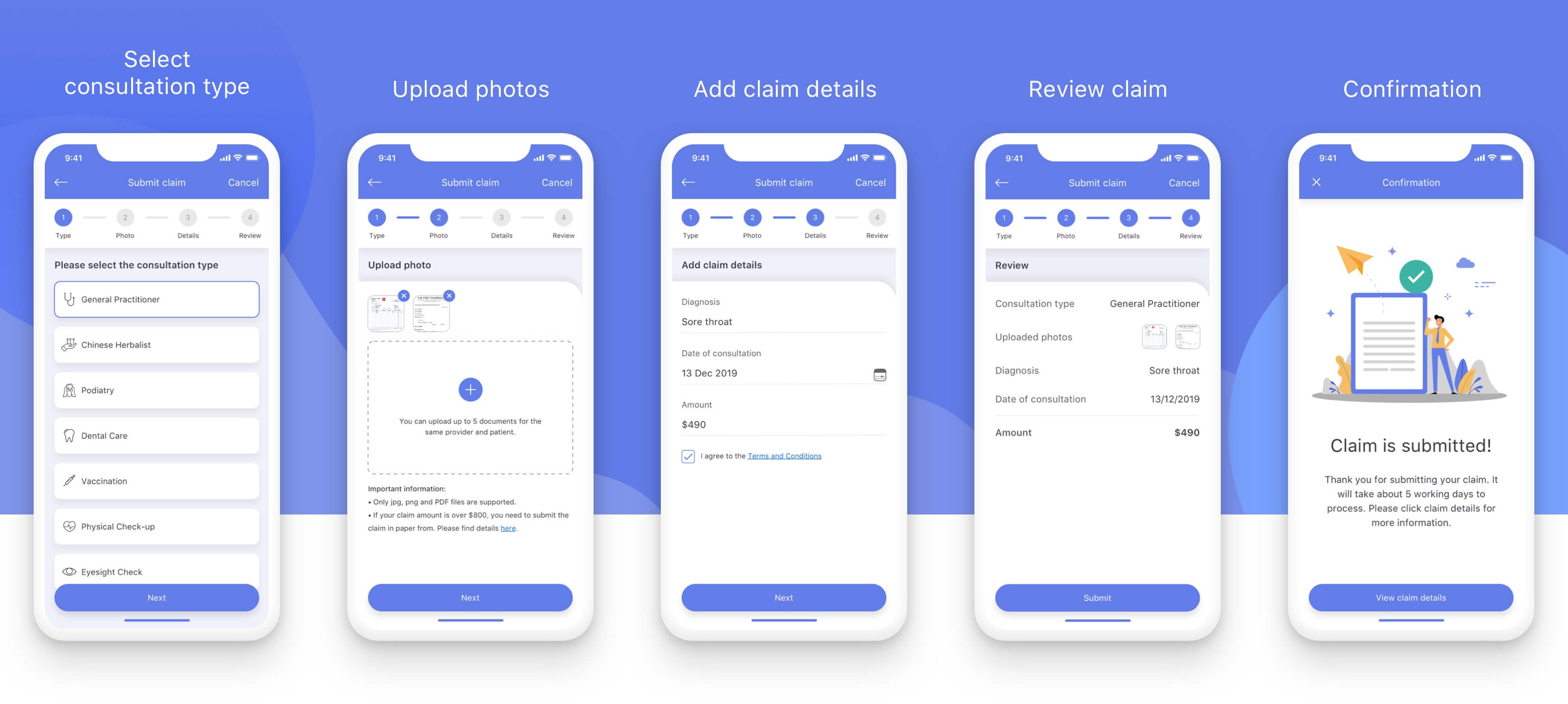
Progressive disclosure can lower the chance that users feel overwhelmed by what they encounter. I included the progress tracker in the new design so users can focus on one task at a time.
The Problem
According to the user research, users mentioned design of the form can be improved. The form is busy, the input fields aren't obvious and there isn't much error prevention. Users can't tell what type of consultation they can claim for at first glance.
The Solution
I took reference from the checkout design of some online shopping apps. By using the progress tracker, users can submit a claim step by step. Most importantly, they can review the claim details before submitting, and see a confirmation once the process is completed.
3. Search for a Doctor
The Problem
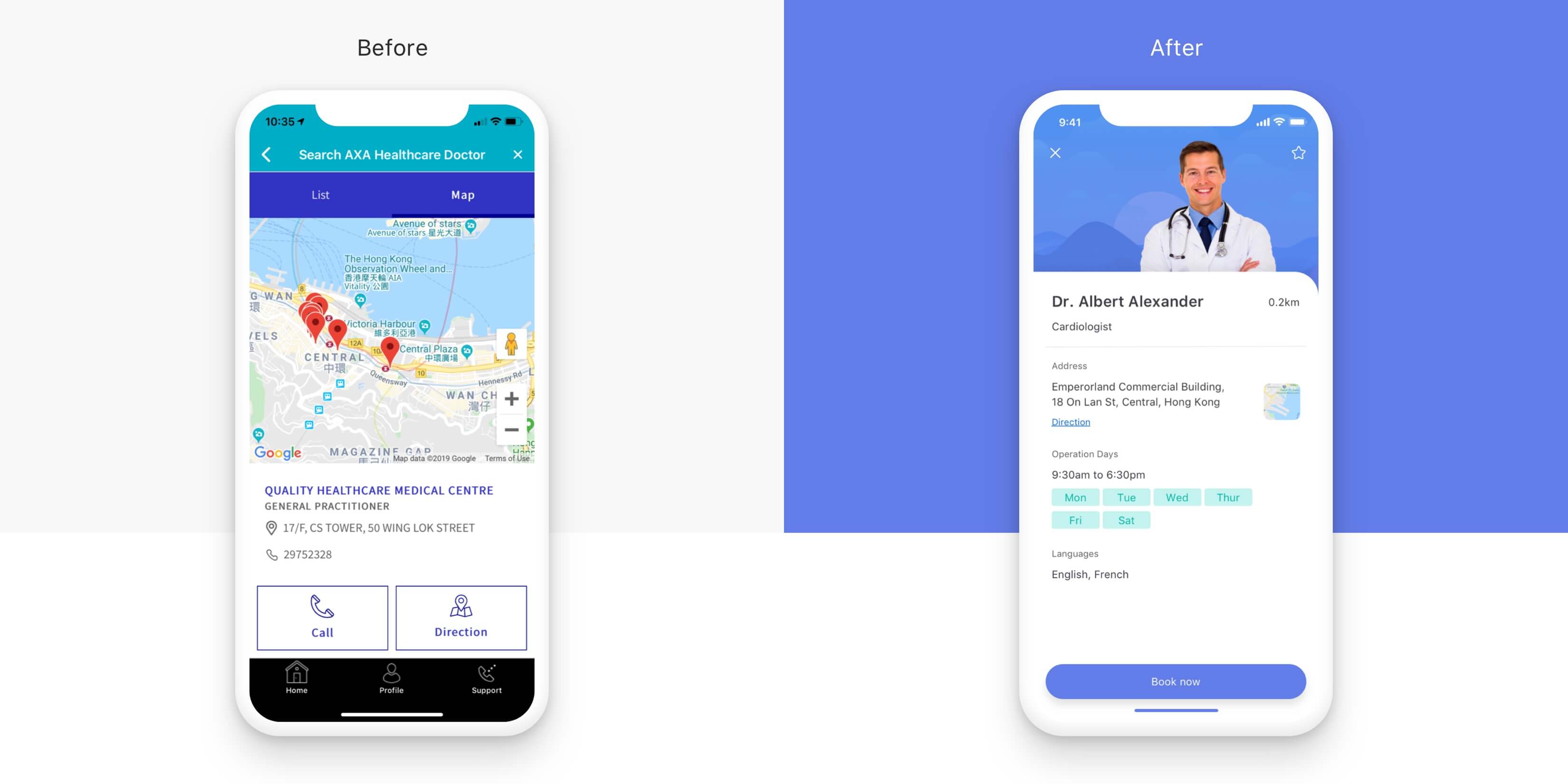
According to the user interview and reviews of the app, some users found that it's not easy to look for the right AXA panel doctor. Users can't filter what doctor they actually want and the map is difficult to use. The interface is also poorly designed and distracting.
The Solution
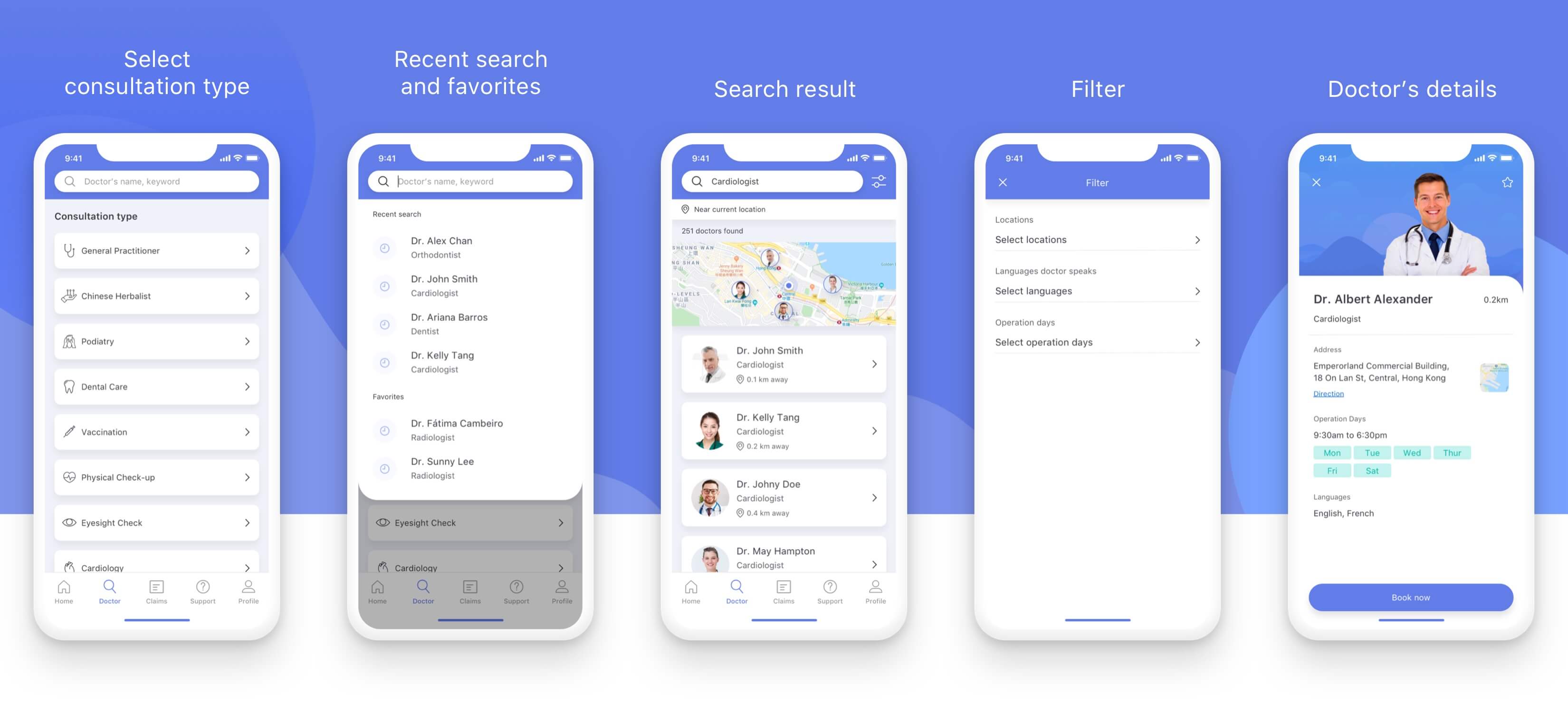
I added the search box on top so users can easily look for the right doctor by inputting keywords and doctor’s name. When they start to type in the box, the dropdown shows their recent search and favorite doctors they saved earlier. Besides using the search box, users can choose the consultation type directly.
On the search result page, the map shows how far the doctors are to the user’s current location. Also, the filter function allows them to choose other locations, languages and operation days of the clinic.
Visual Design
A beautifully designed health insurance app can help improve users’ loyalty and help them find better services. The redesigned app is more intuitive and hierarchical, it has a clearer layout that can attract users. I also used a lot of white space and paid attention to alignment so the visual communication experience is improved.
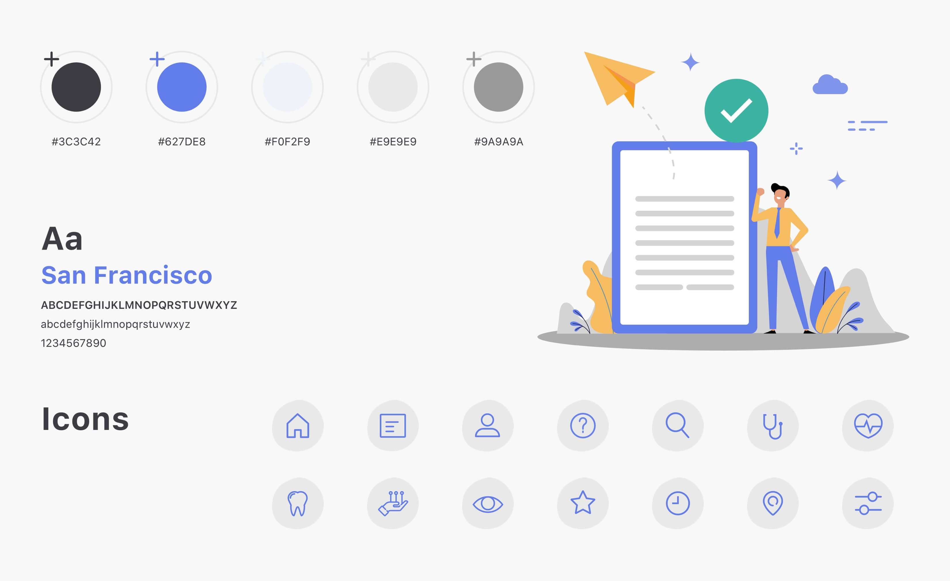
Since MyAXA HK is a B2C app, I adapted the corporate blue color but modified it to be more soothing and empathetic. One big emotional design principle is using the right color to retain users, this soft blue color I used can foster a sense of security and comfort. I also designed a new set of icons for this app. By adding the illustrations and icons, it's easier for users to find what they are looking for by just looking at the visual. I also added shadow behind the cards and call to action buttons, the elevation makes these clickable items more obvious.
Learning
Redesigning the MyAXA HK app was a fun and challenging project for me, I learned a lot in the process. One thing to keep in mind for design challenges is to narrow down the pain points and suggest solutions only for the major tasks, that's why I only focused on three jobs-to-be-done throughout the whole case study. If I had more resources, the first thing I will do is to spend more time on the wireframe and interface design iterations, also other possible solutions.
I showed the new design to some people I interviewed previously, they like the idea and said they would love to use this app! One user mentioned “If AXA launched this app, I don't need to call their hotline as often as I do right now!” I will validate the design with more testing, and measure the usability by looking at the number of successful claims, the number of calls to the doctors inside the app, and discoverability of features as well as usage.
